Rebrand for Philadelphia Corp. for Aging
Founded in 1973, The Philadelphia Corporation for Aging (PCA) is a nationally recognized Area Agency on Aging and is primarily funded to help older Philadelphians and those with disabilities achieve their maximum levels of health, independence, and productivity through the provided services and programs.


Why Choose to Rebrand?
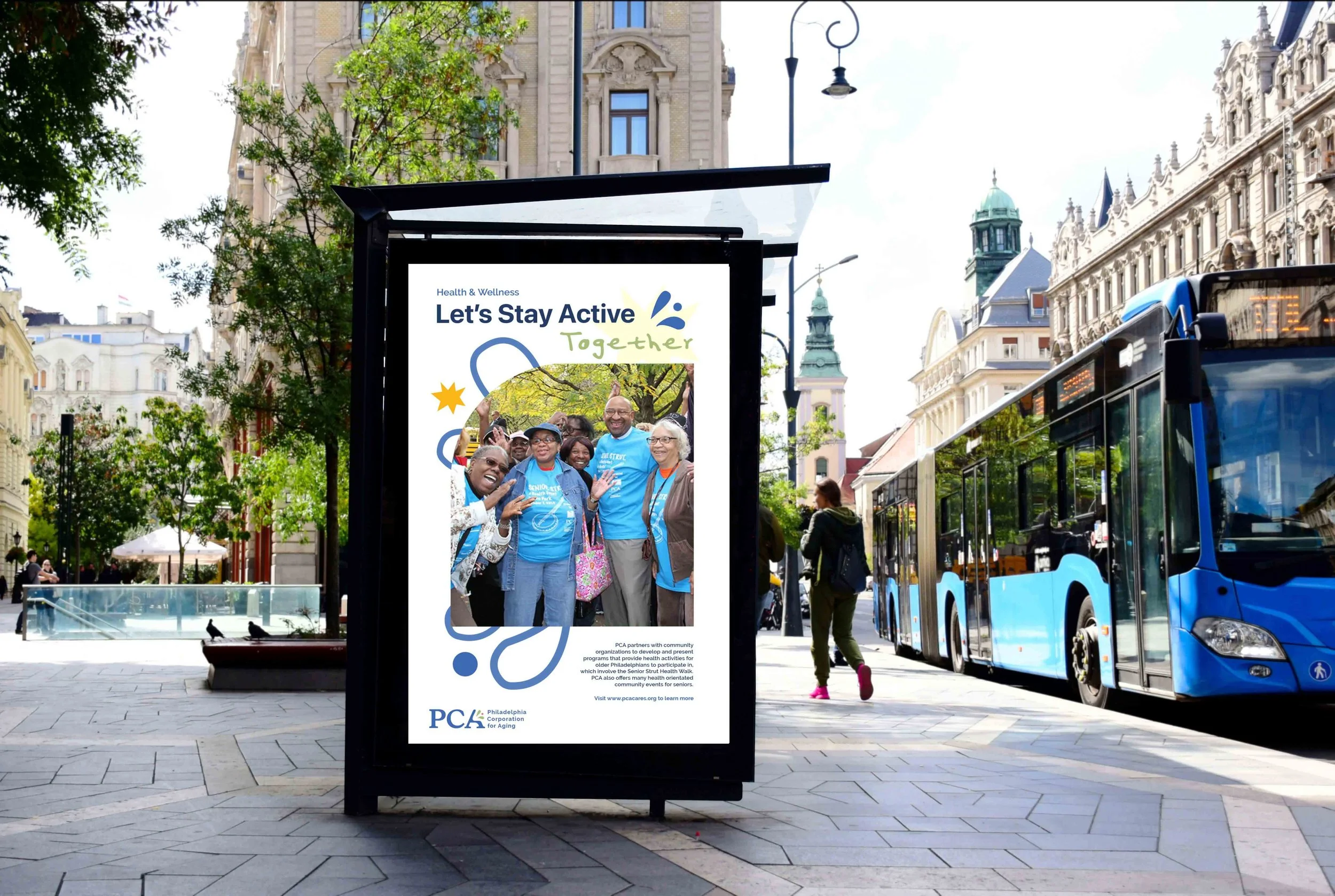
I wanted to create a further evolution of the current brand, aiming to highlight the positive and enriching life the older generation holds in their independence with the assistance of the organization’s services and programs.
Although everyone’s experiences with elderly care is different, I found that as I was researching into the PCA, there were many great resources for both physical and mental health, along with home care as well. I personally wanted to show the energy that the elderly continue to have and experience through these programs in order to assure those receiving the care, along with their families / friends that they are in good hands.

Meaning behind the Logo
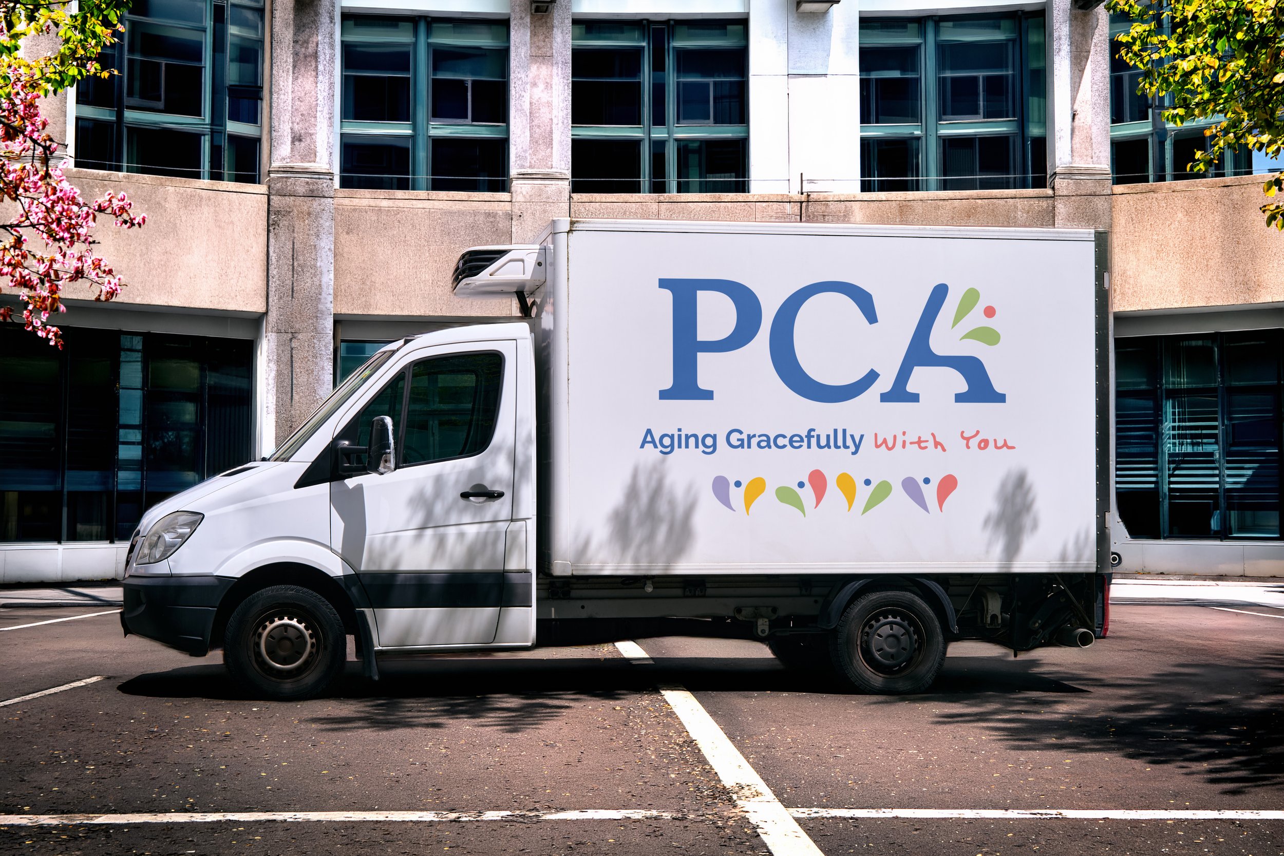
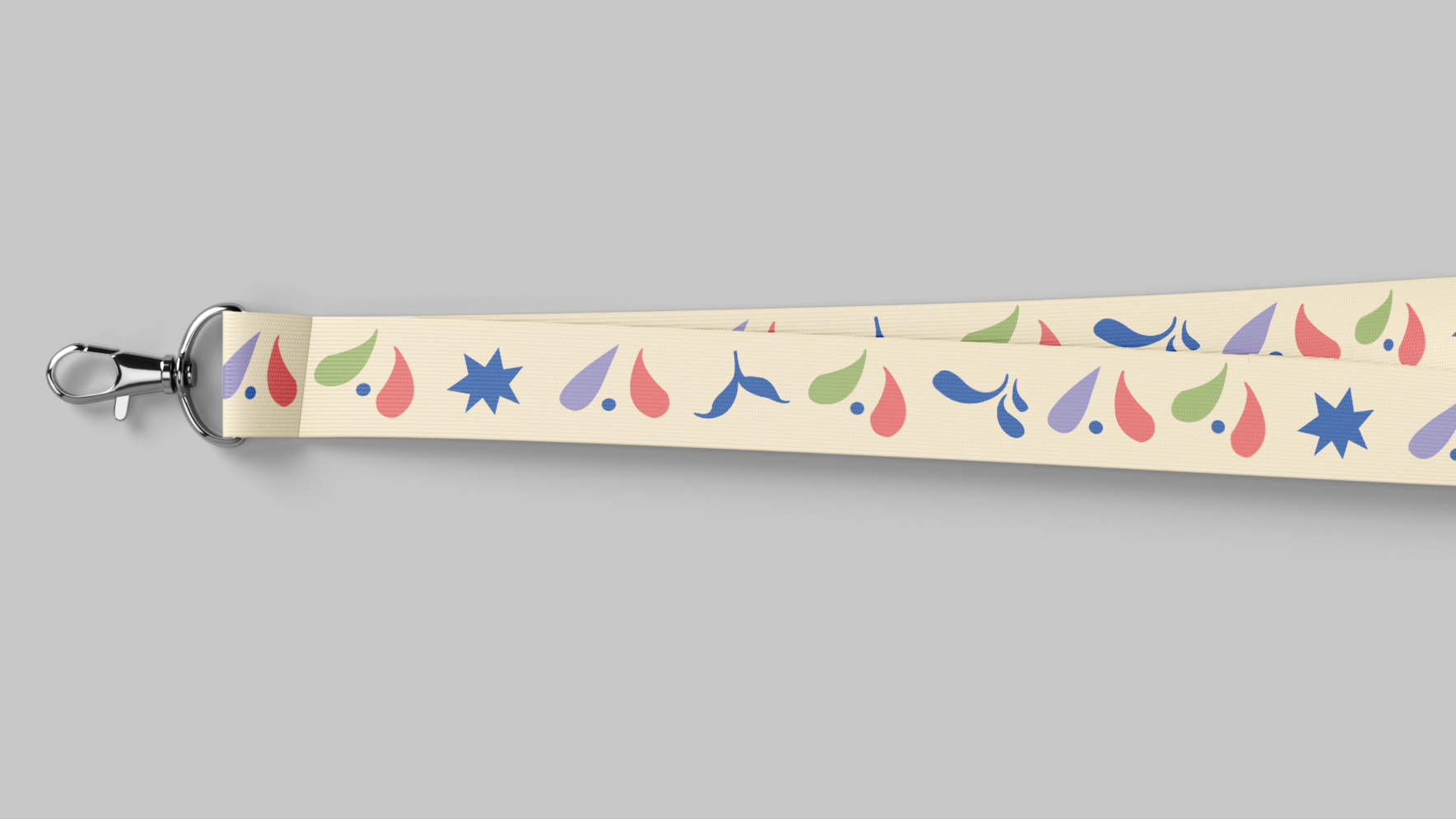
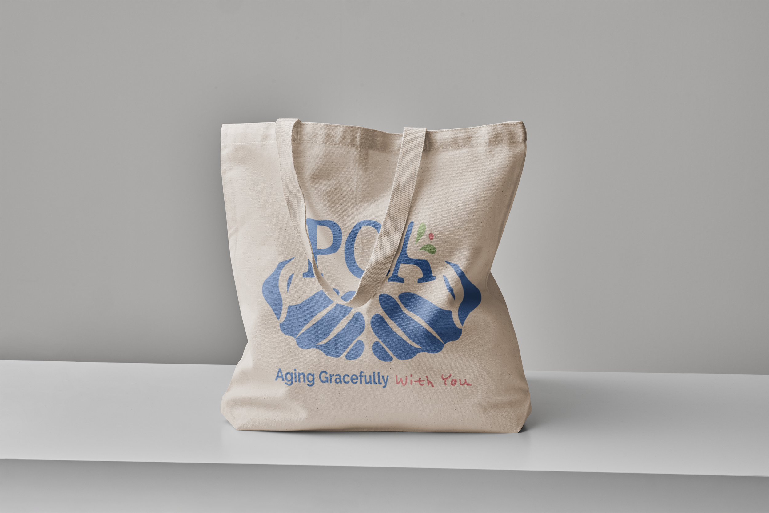
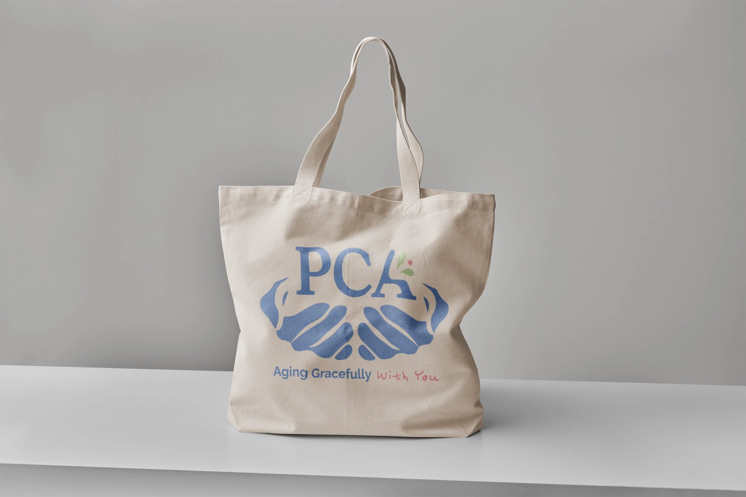
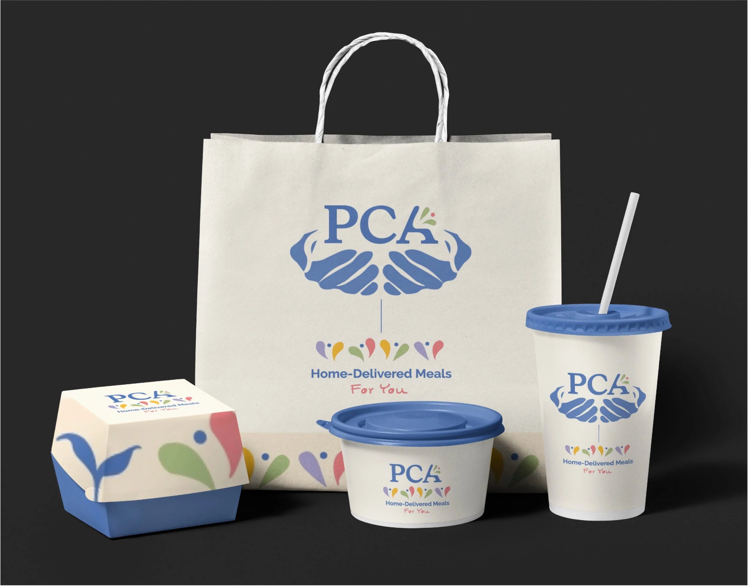
This rebranded logo was designed to convey warmth and vibrancy to the individuals who are part of the PCA. As the original logo used the aspect of a "sun" asset to portray this approach, expressive figures "jumping" for joy in a community setting were incorporated to enhance this message. The PCA has a variety of resources for the elderly, including medical assistance, home repair, transportation assistance, and community gatherings. Because of these aspects, supporting icons were created to help illustrate and give attribute to those characteristics.