Branding for a Nutritious lunch box made for you.
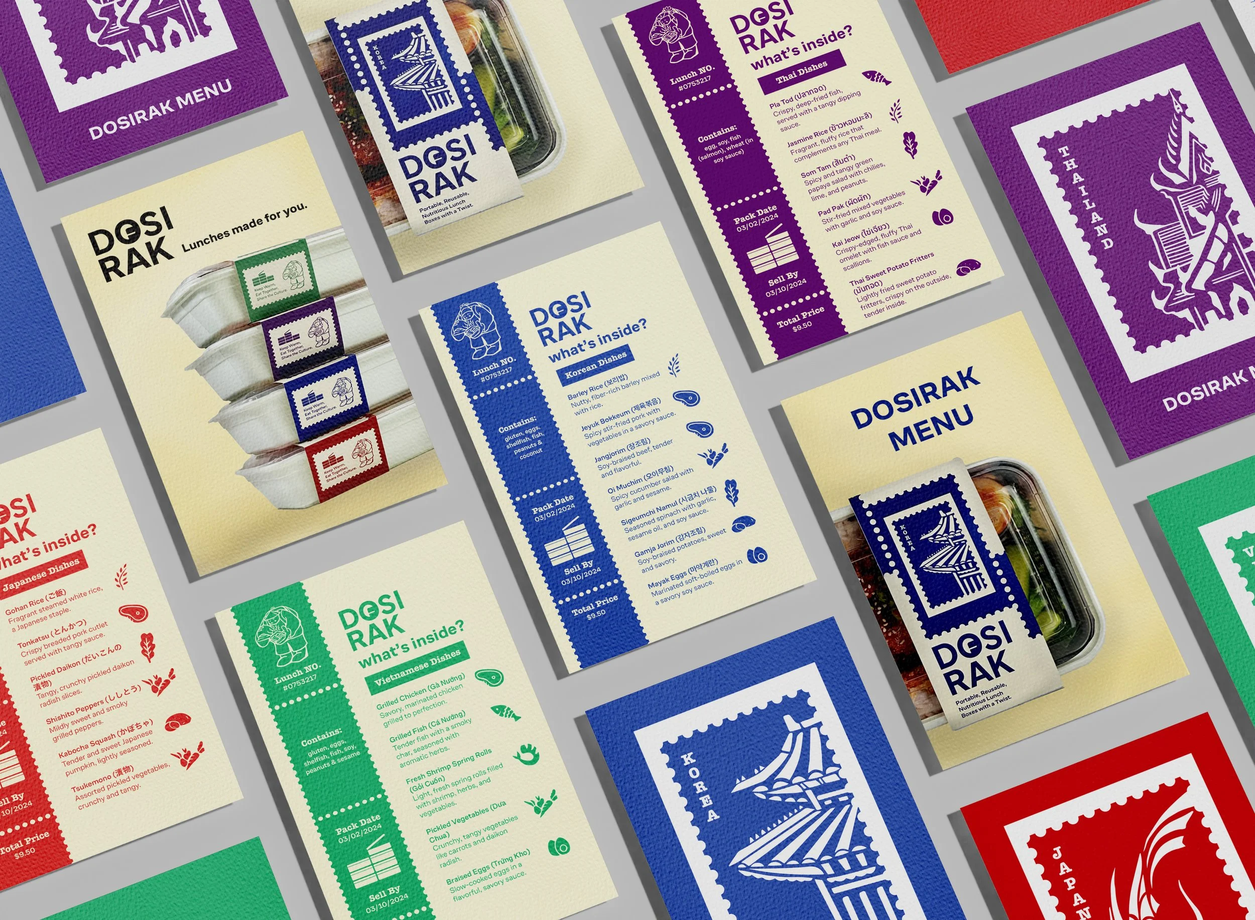
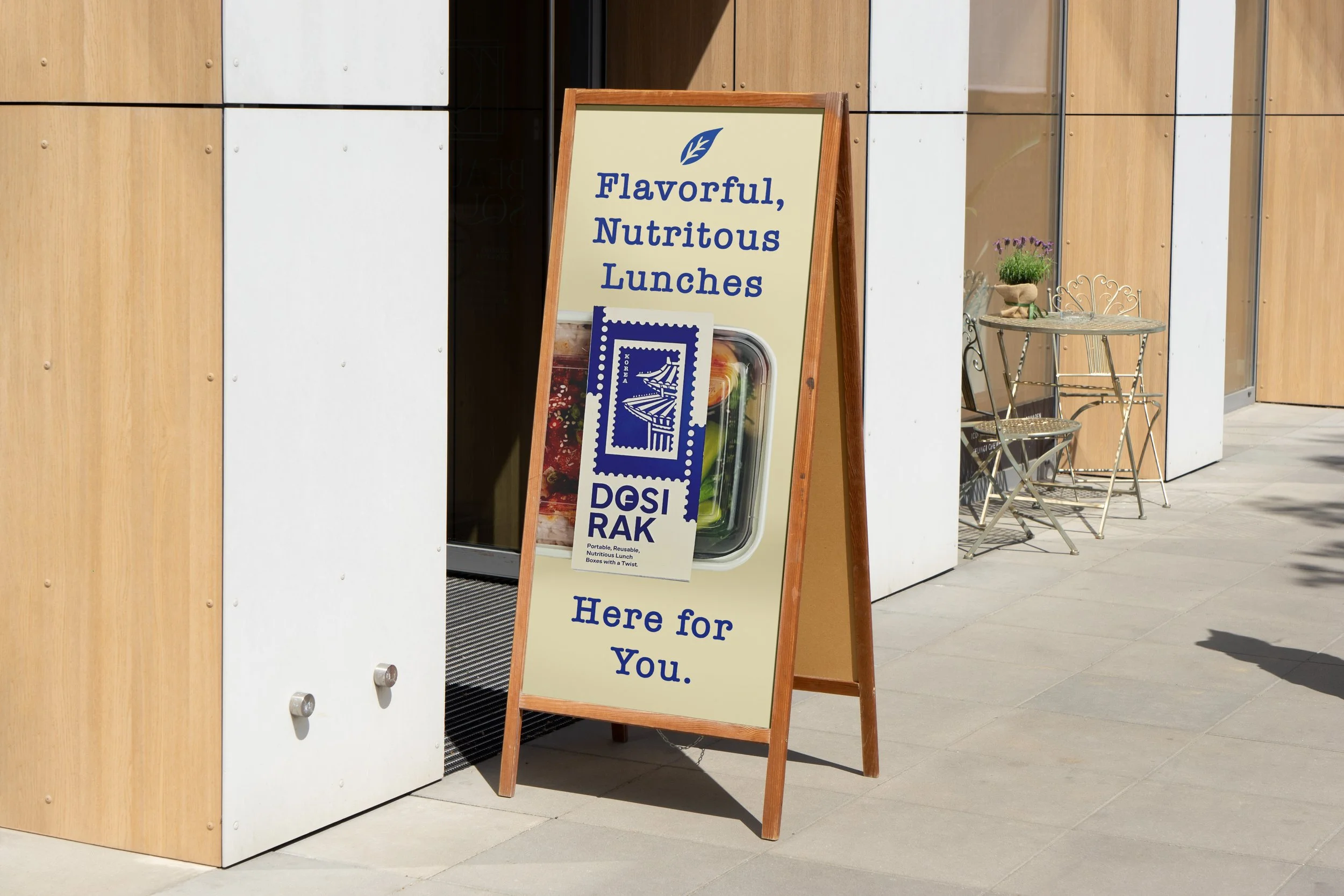
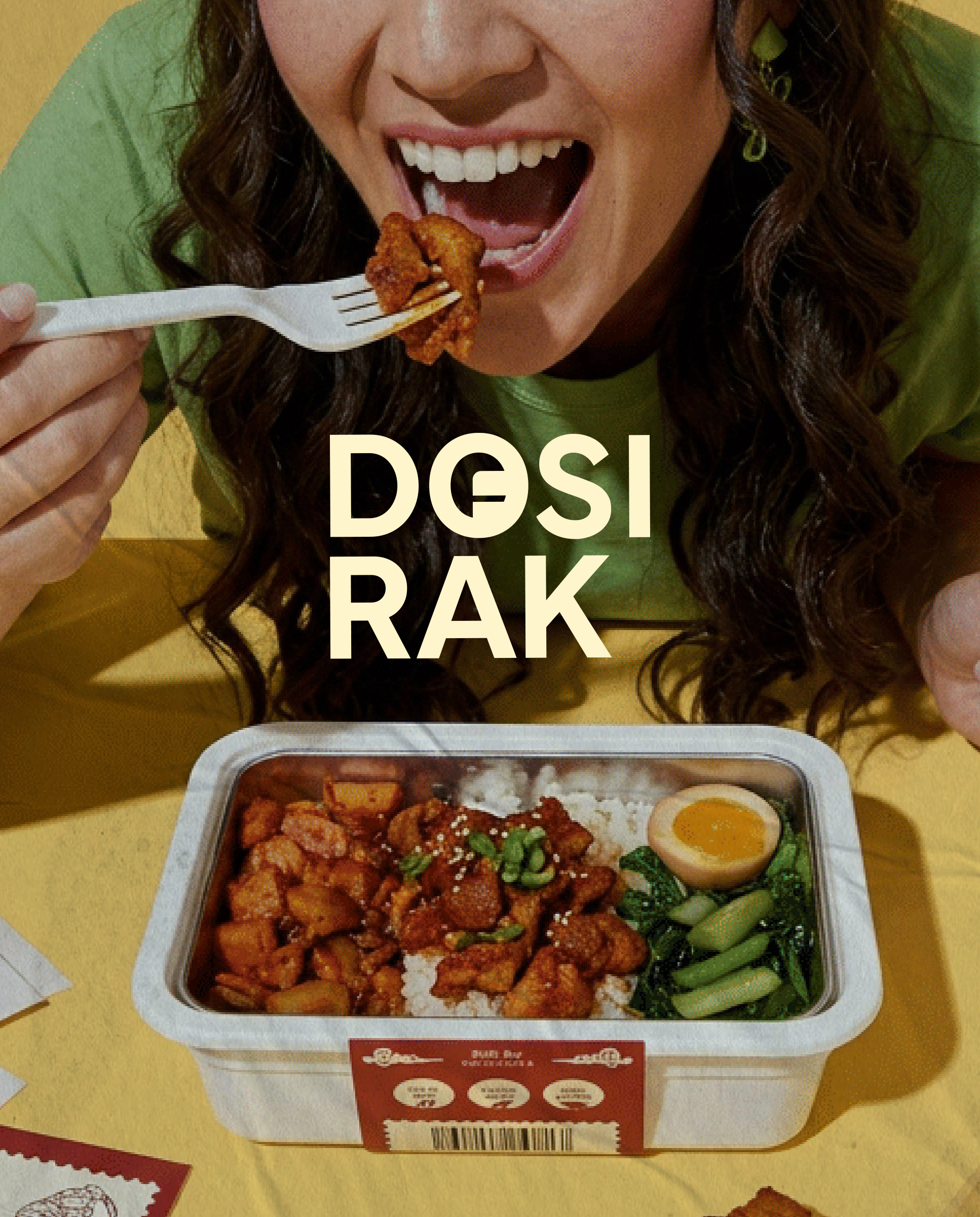
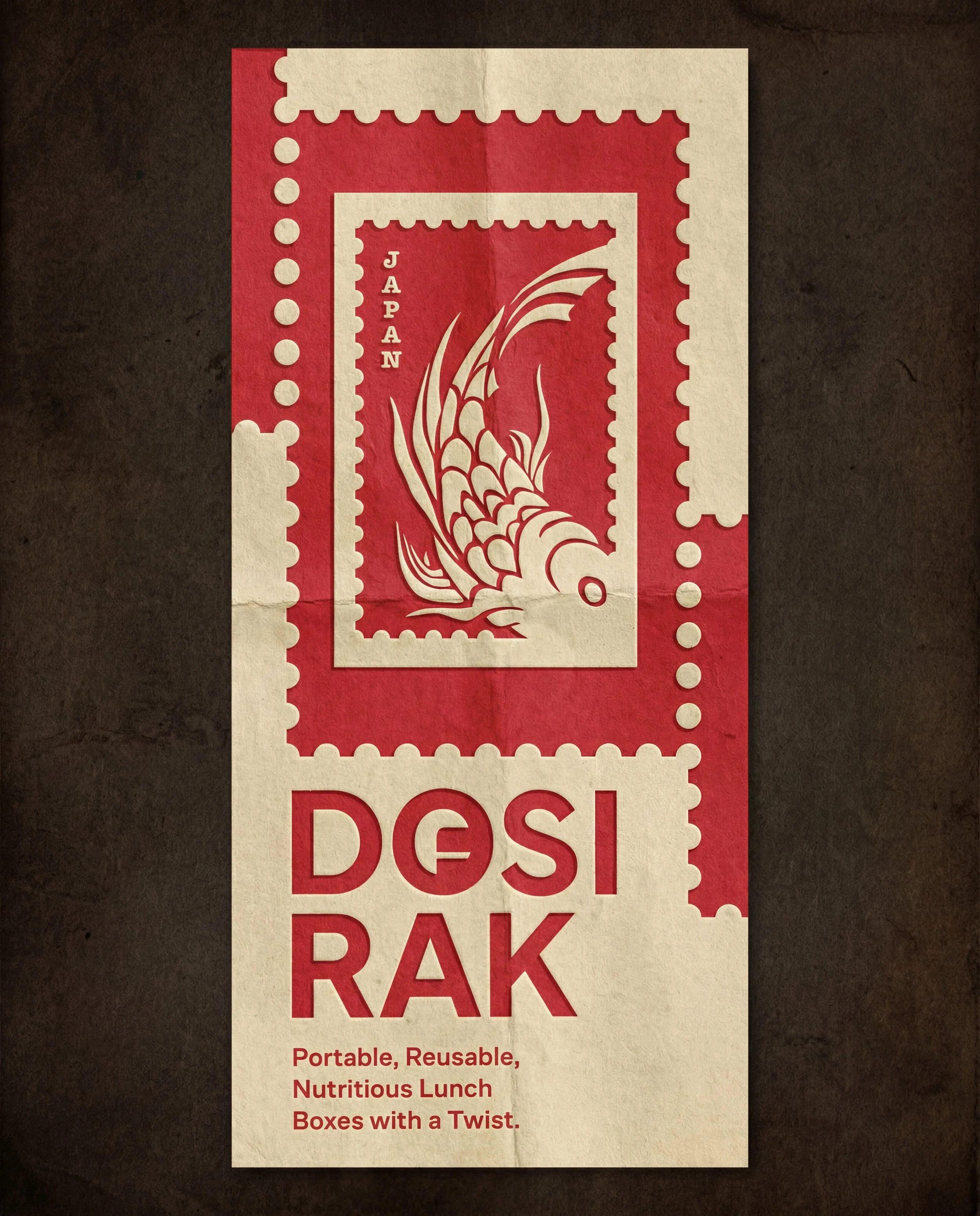
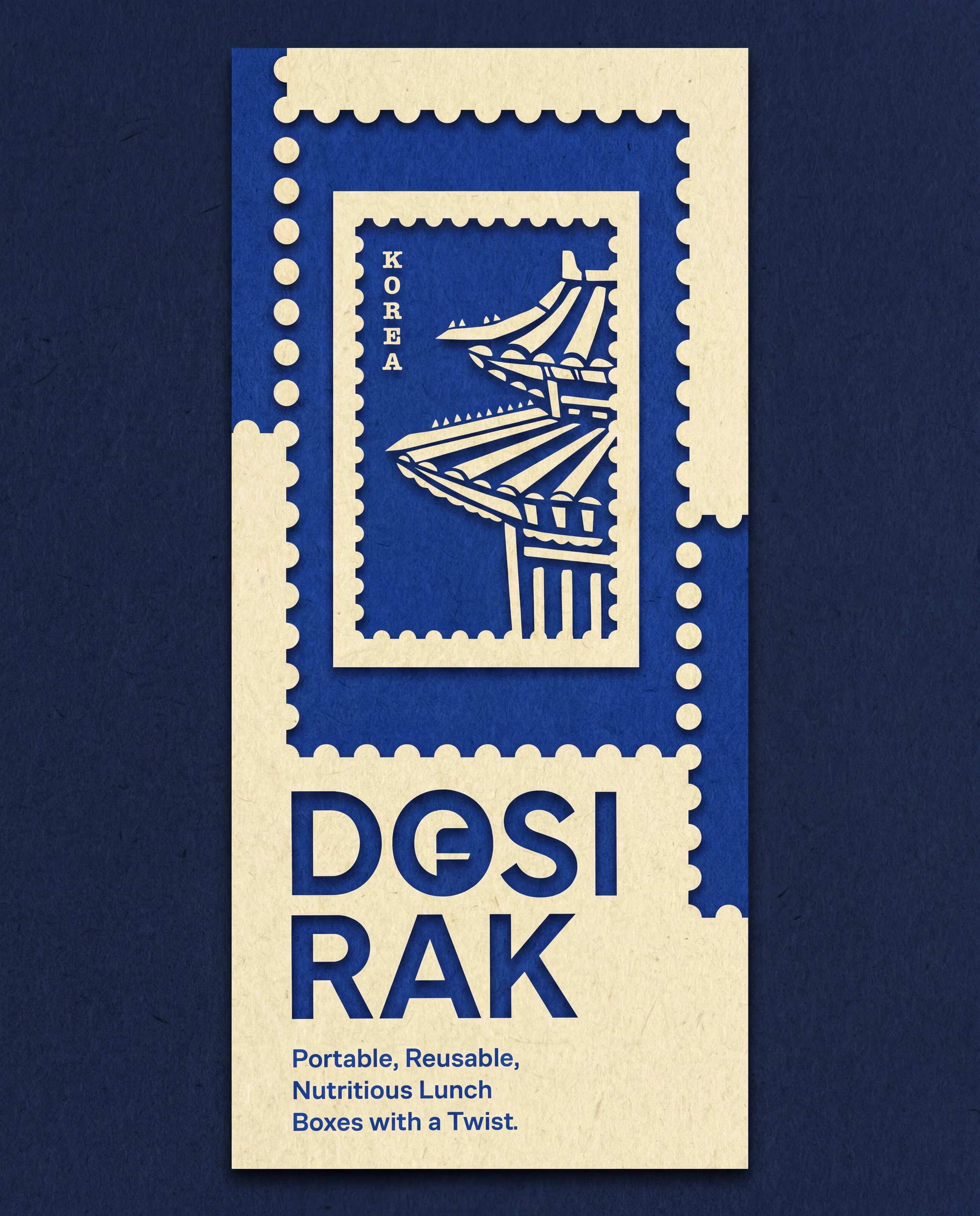
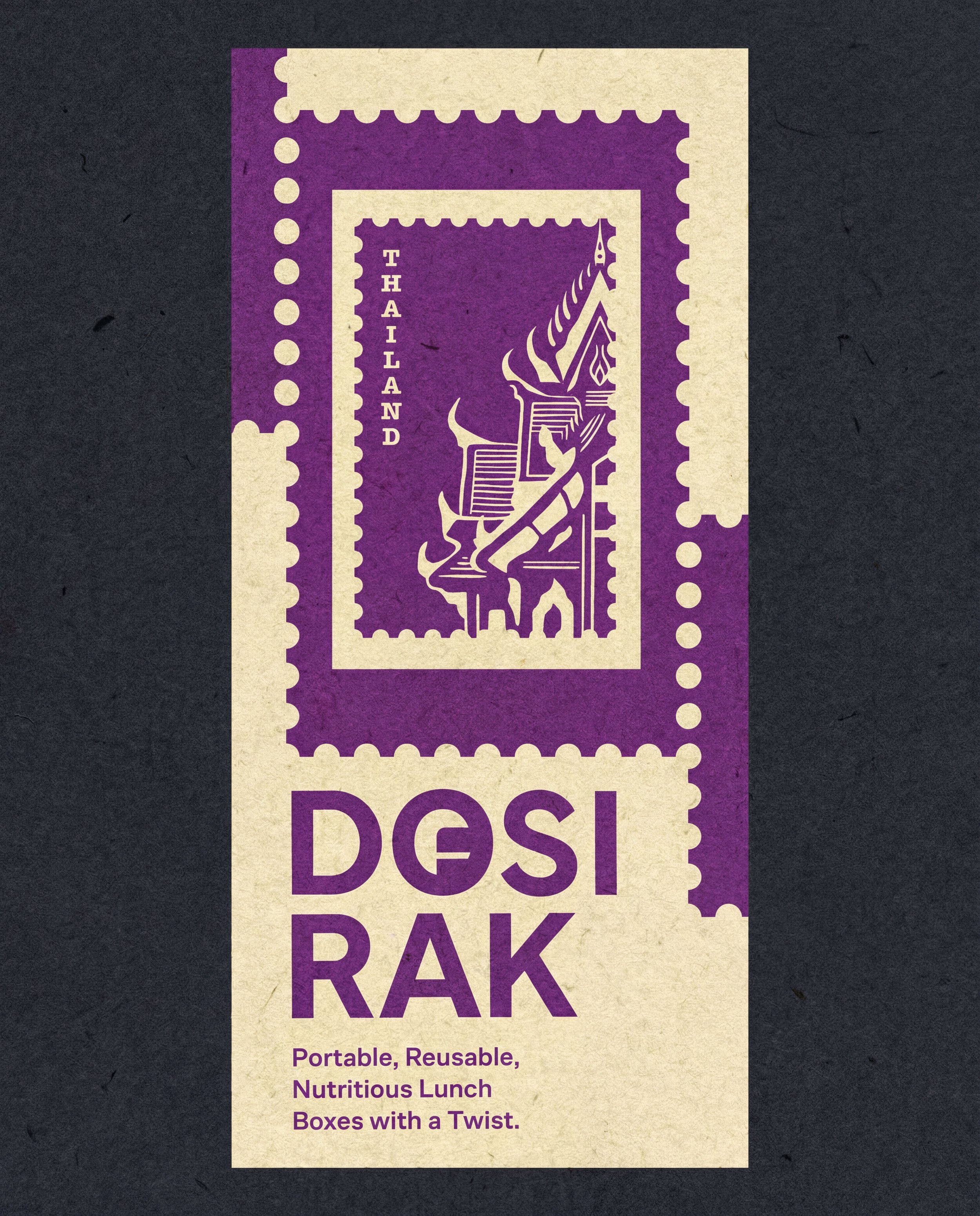
Dosirak is a portable, nutritious & unique packed lunch inspired by the the traditions of the Korean lunch box named “Dosirak” & traveling through different cultures. The lunch box series consists of 4 East Asian Cuisines — Japanese, Korean, Thai and Vietnamese.
How did this brand come about?
The reason why I chose to explore the area of food and travel is not only because of my personal interests, but I also recognized the nutrition value of these cultural lunches that could be educational and also providing a good source of value to a common worker class. I wanted people to be able to feel as if they had explored a different culture without necessarily traveling, with the same quality of home-cooked food in a portable way.
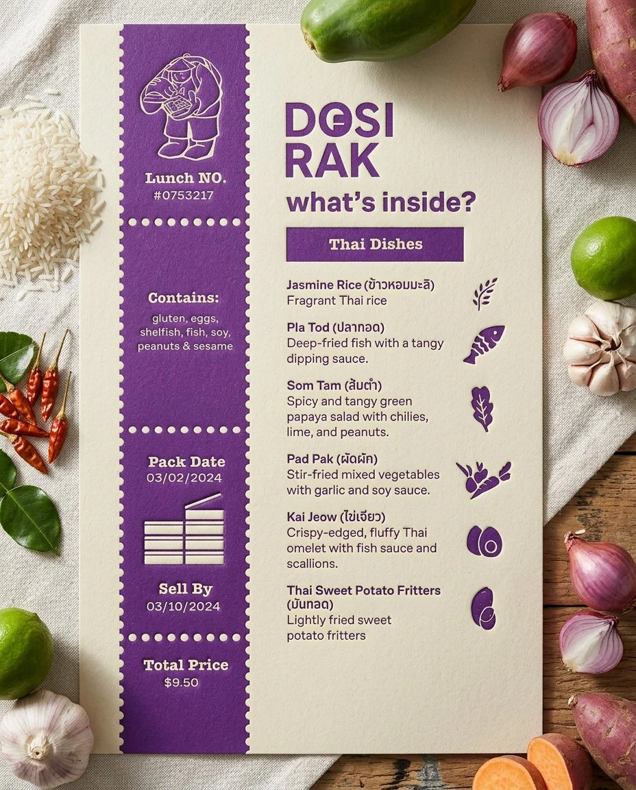
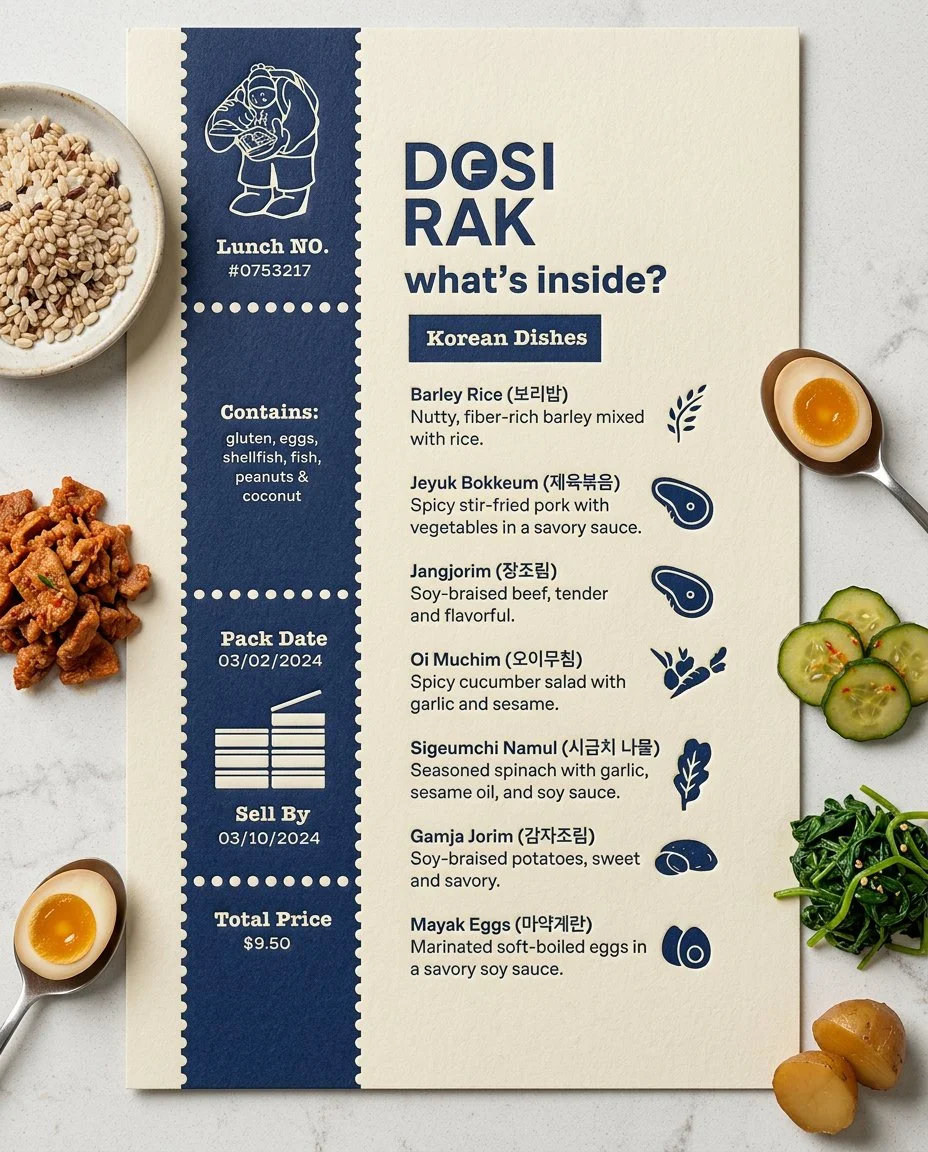
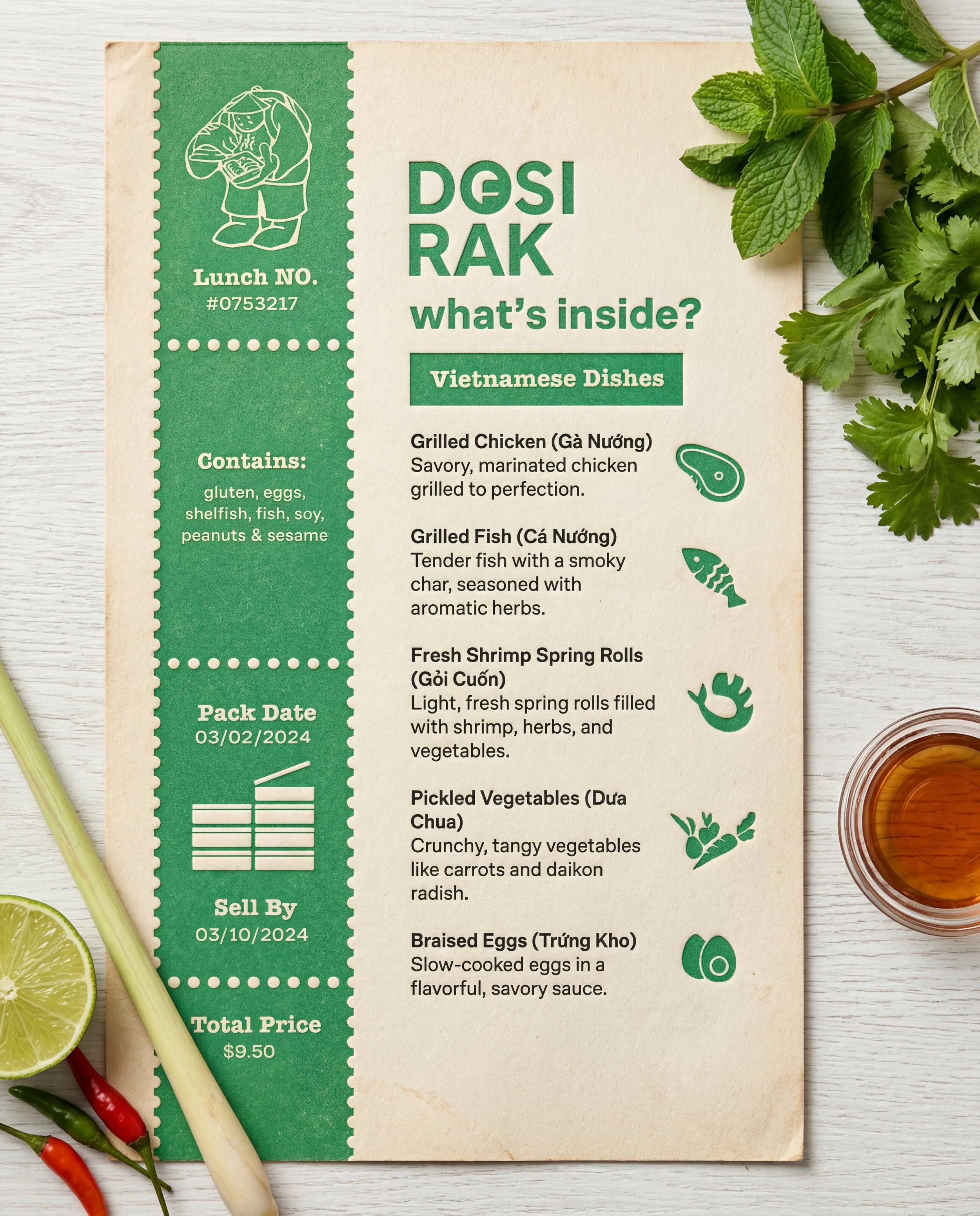
Art Direction + Creative Vision
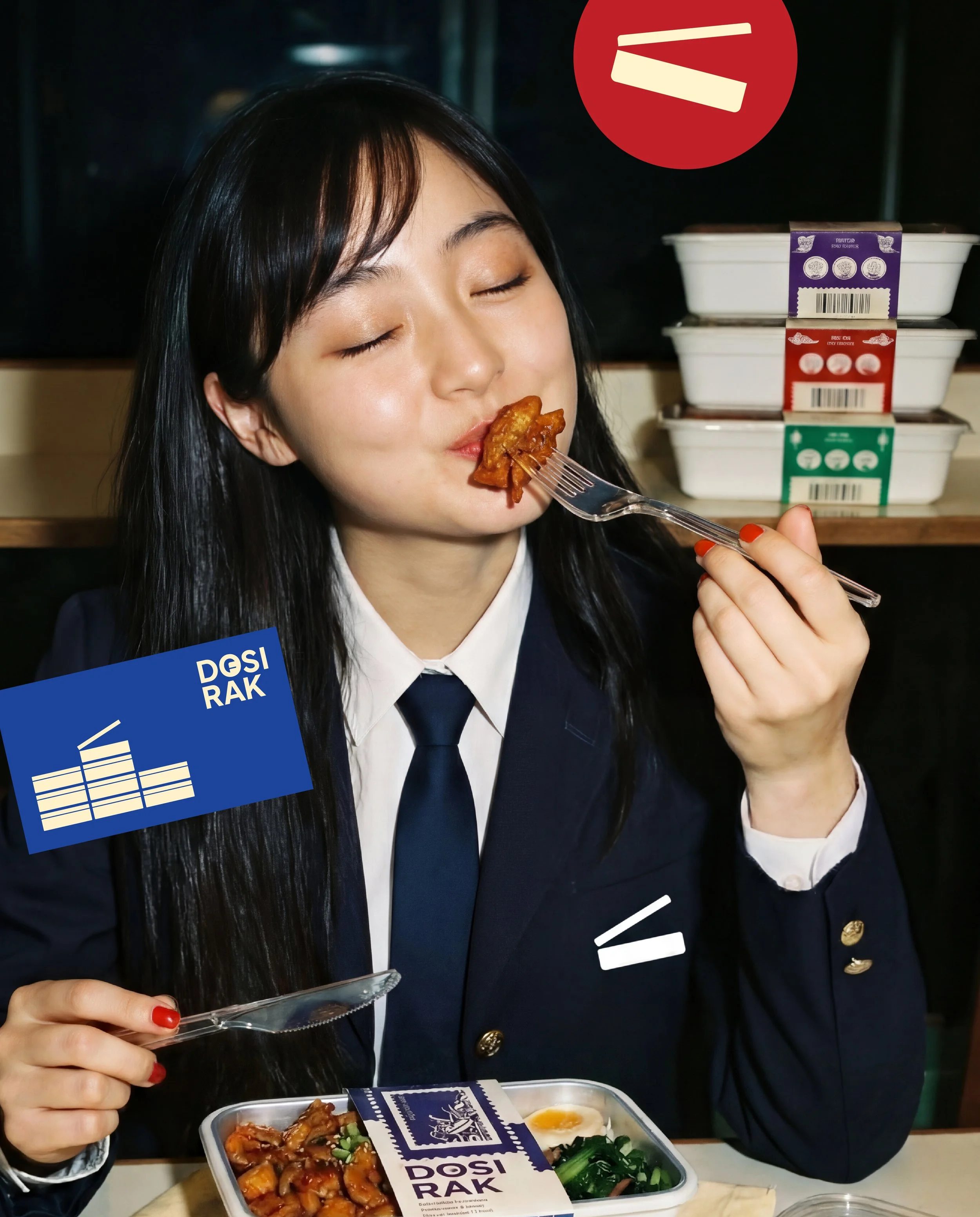
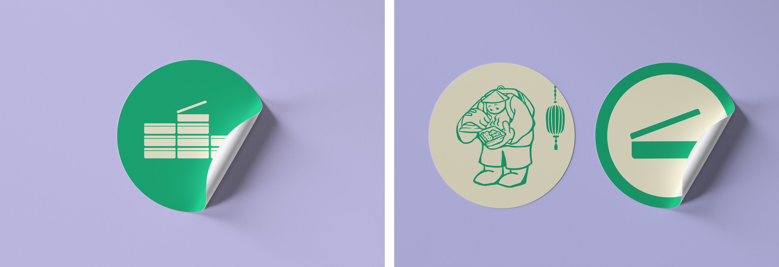
Inspired by the 1970s Korean Dosirak lunch box, (where simple, yet nutritious meals often stacked warmed on classroom radiators) this modern reinterpretation uses the iconic box shape as a symbol of invitation which opening up to cross-cultural exploration through food.
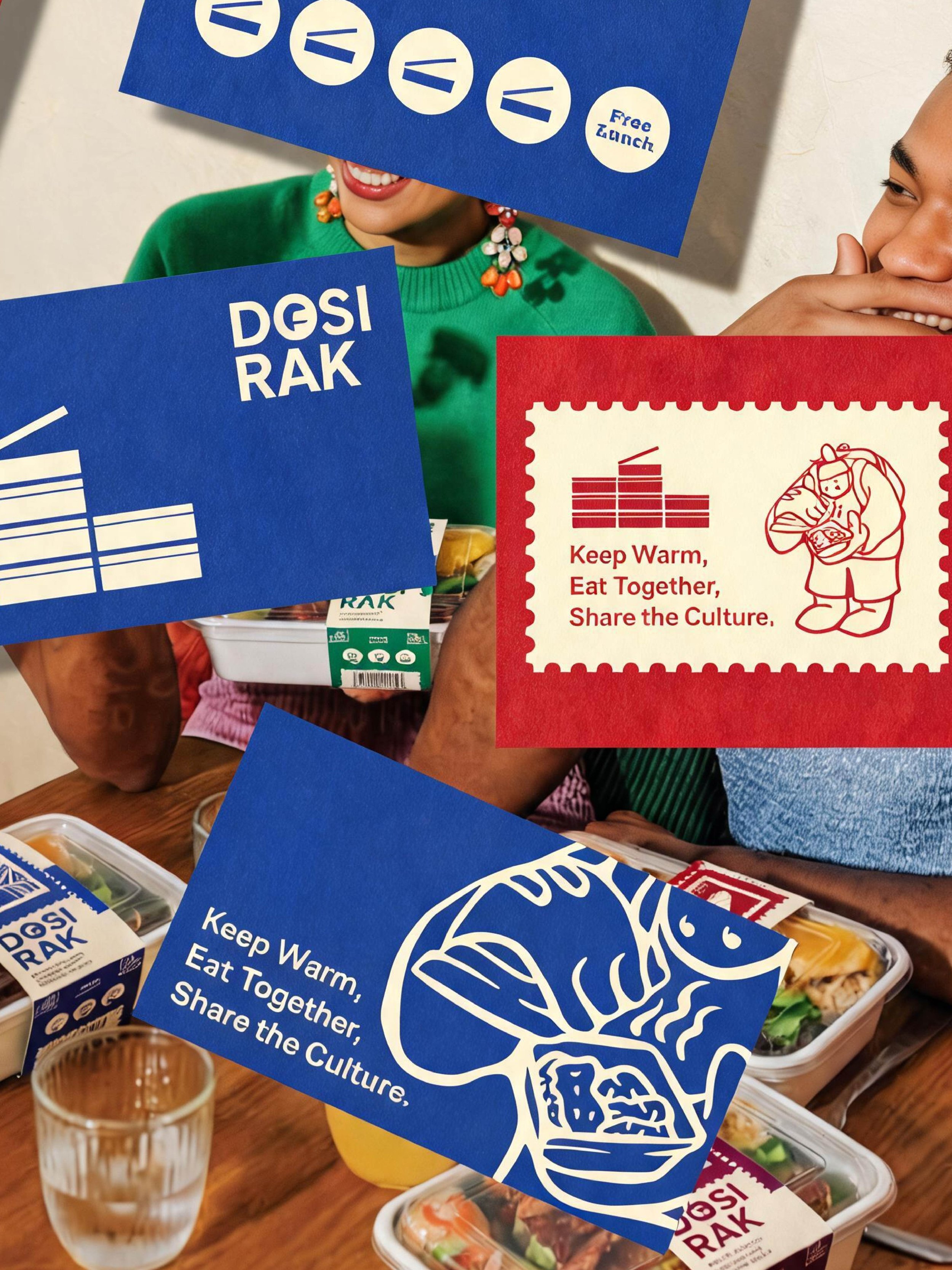
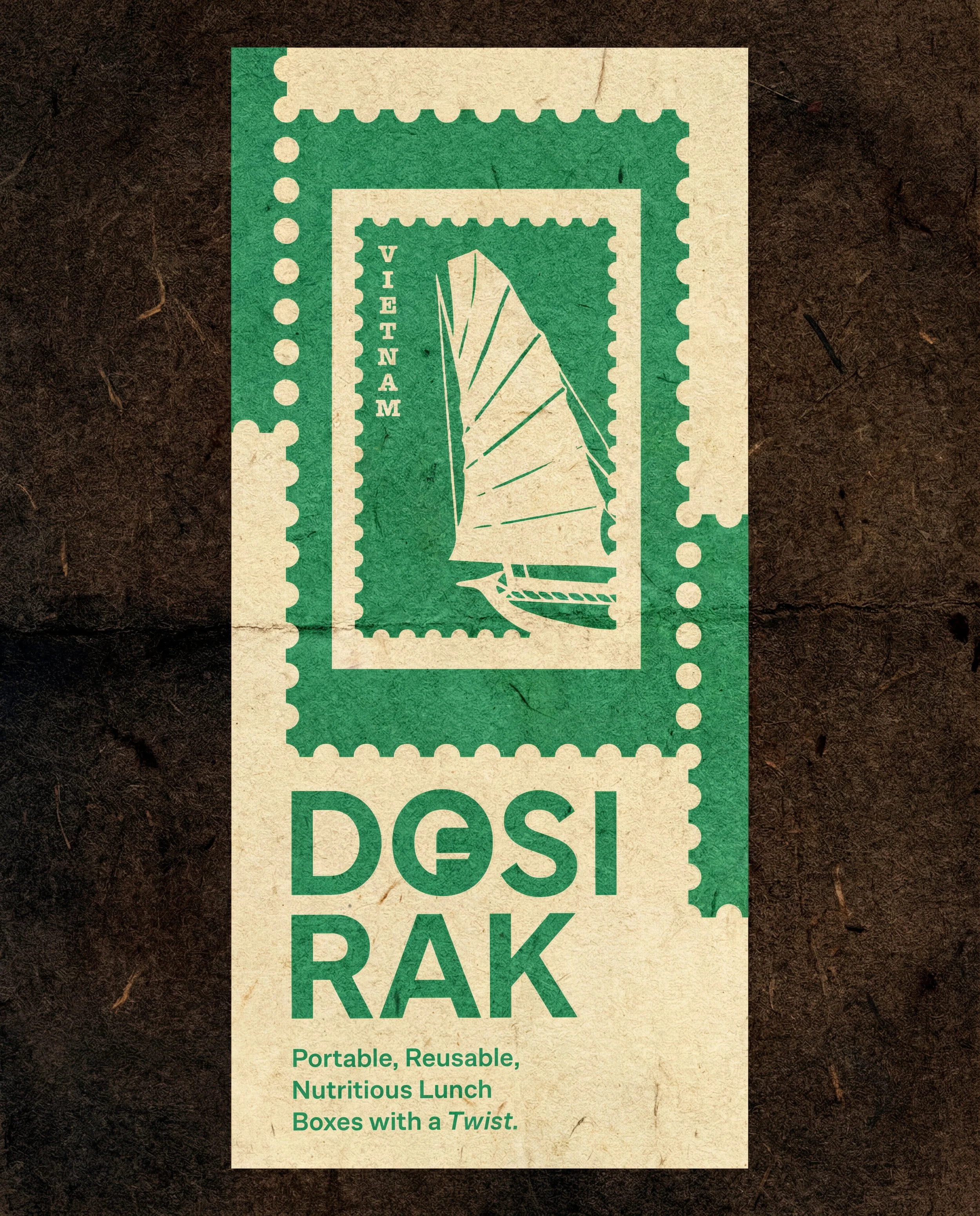
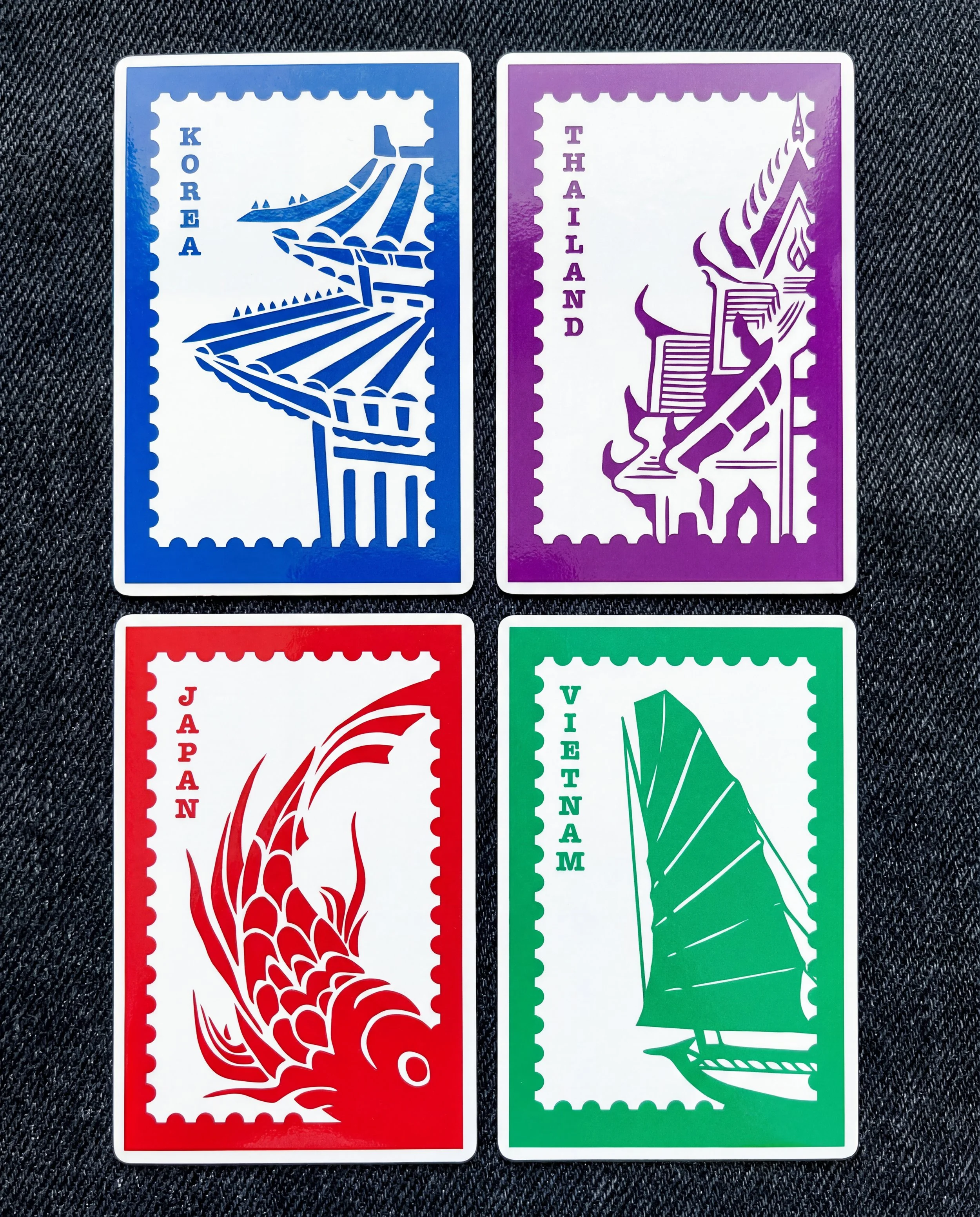
A custom stamp icon reinforces the theme of cultural travel, highlighting the journey each meal represents.
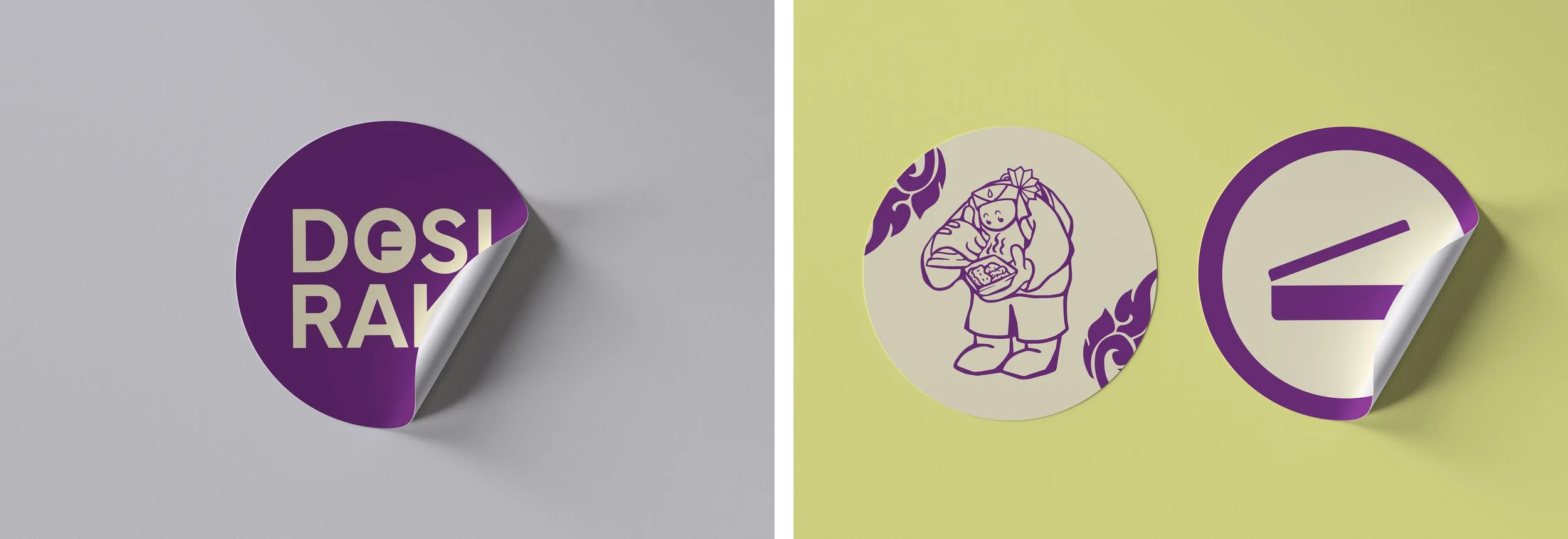
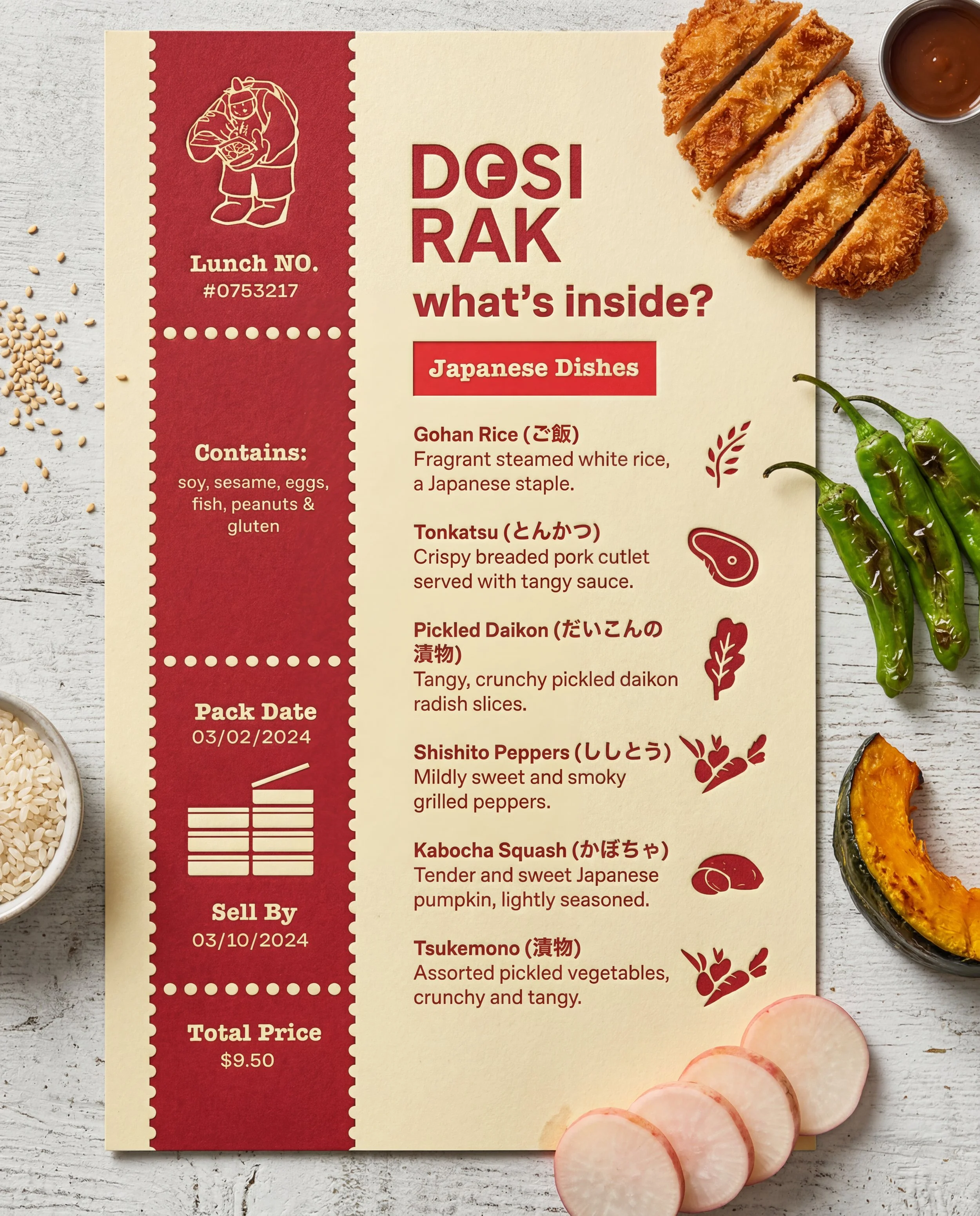
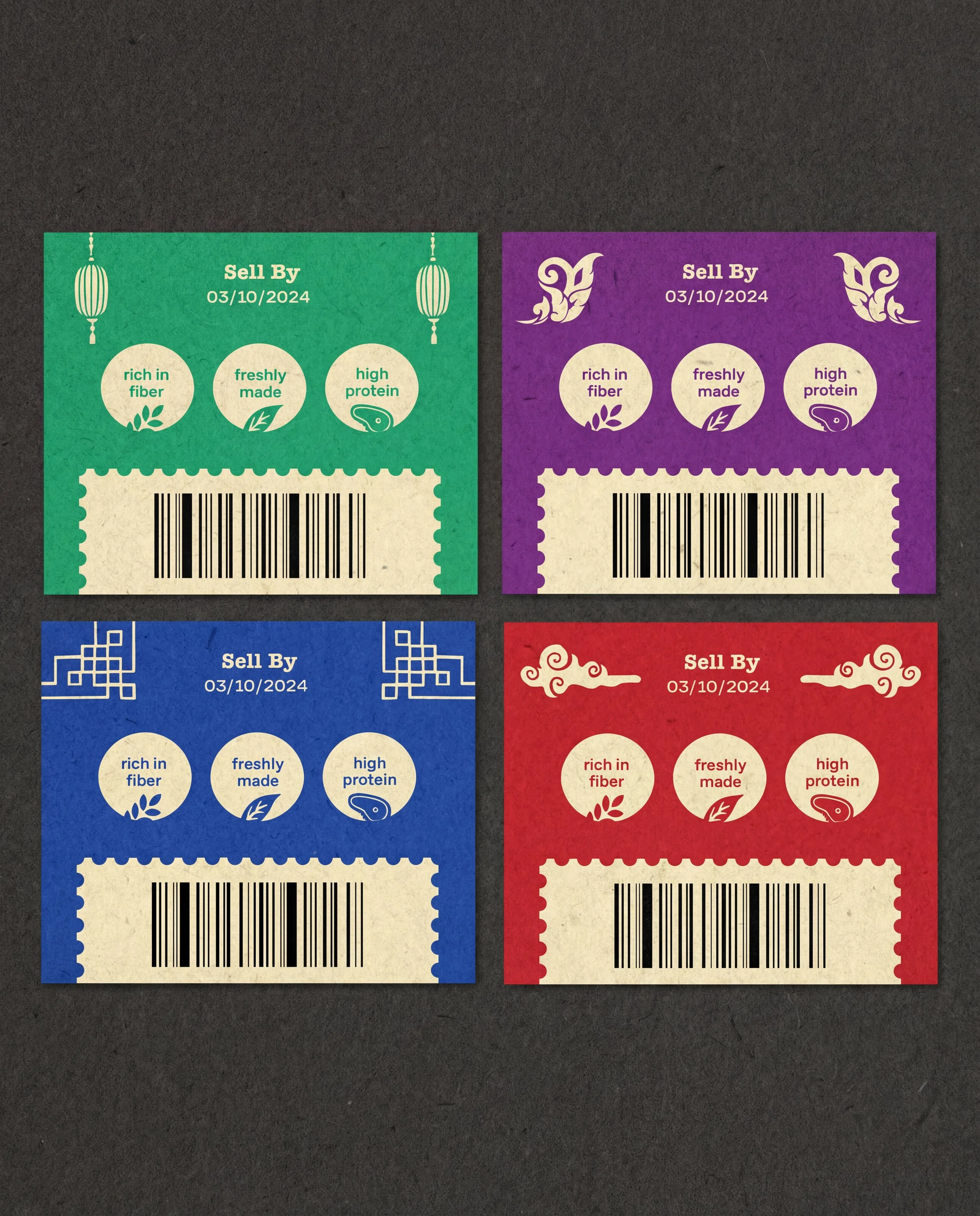
Hand-drawn nutritional elements were created to visually highlight and coordinate key ingredients, reinforcing the meal’s balance and cultural authenticity. Each country was represented by a unique Dosirak character, each wearing traditional cultural headwear to reflect and celebrate its heritage.
Personal Reflections
I learned that every art style has to be consistent to one another — continuously refining to make the illustrations harmonious and not overpowering one another was a challenge. Often simple shapes that showcase the meaning of the brand can very powerful, such as the motif of opening the classic “dosirak box”. It was an iconography that stood out to me due to it expressing exploration of different cultures and a history. I also learned that through a good identity, the possibilities of reach are endless! It would be cool to see the brand expand further into different cultures, identities.
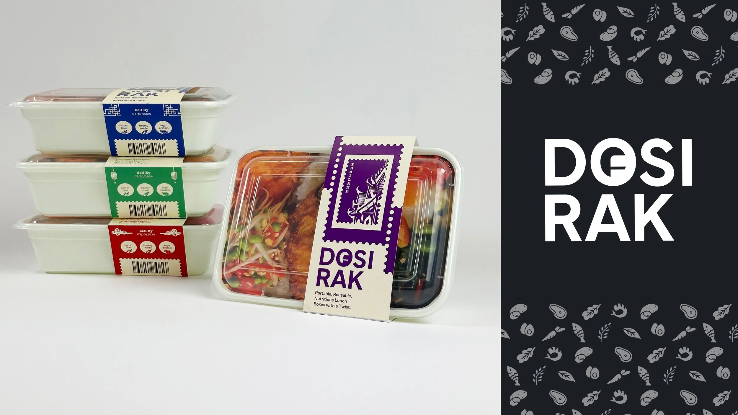
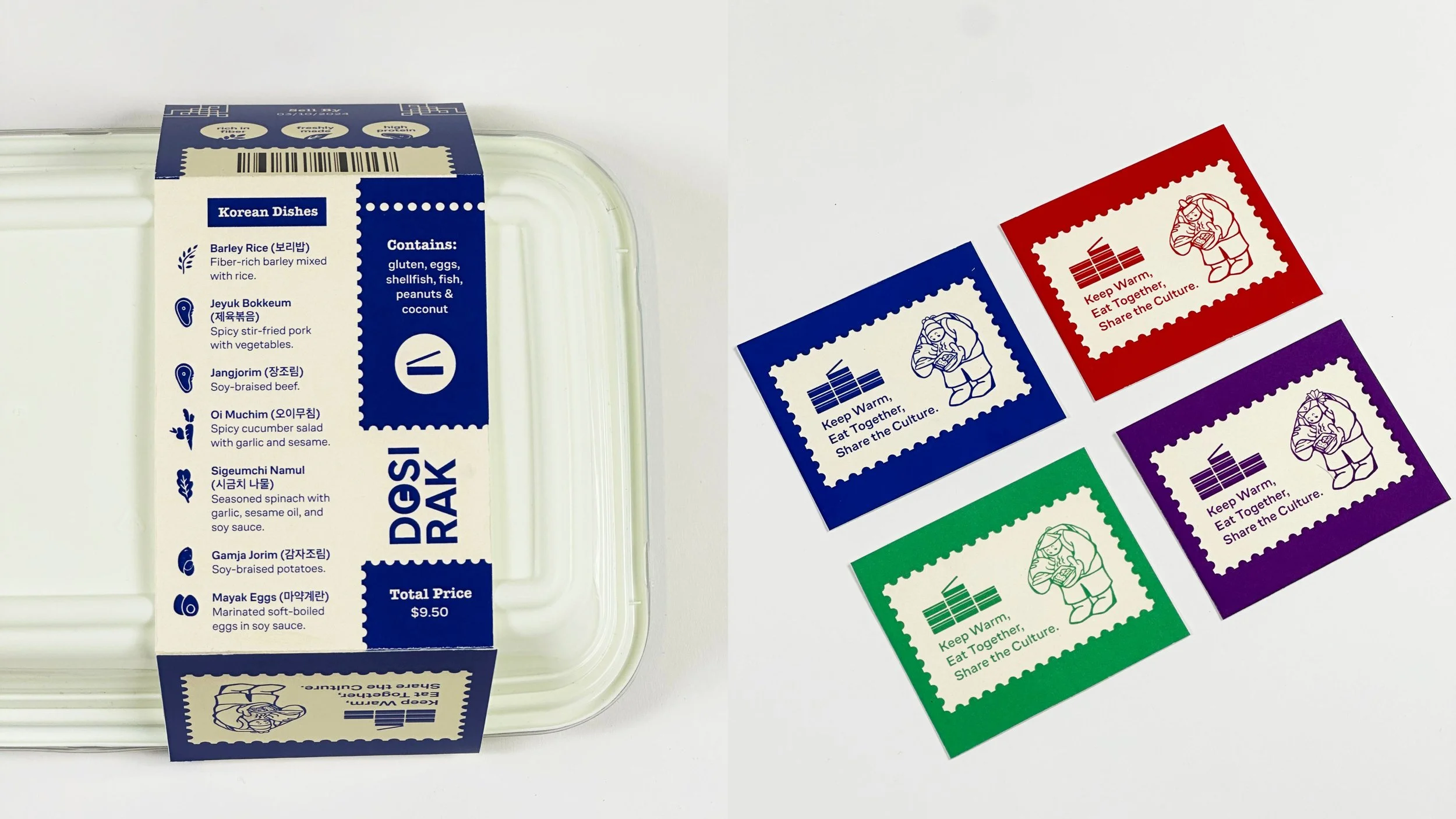
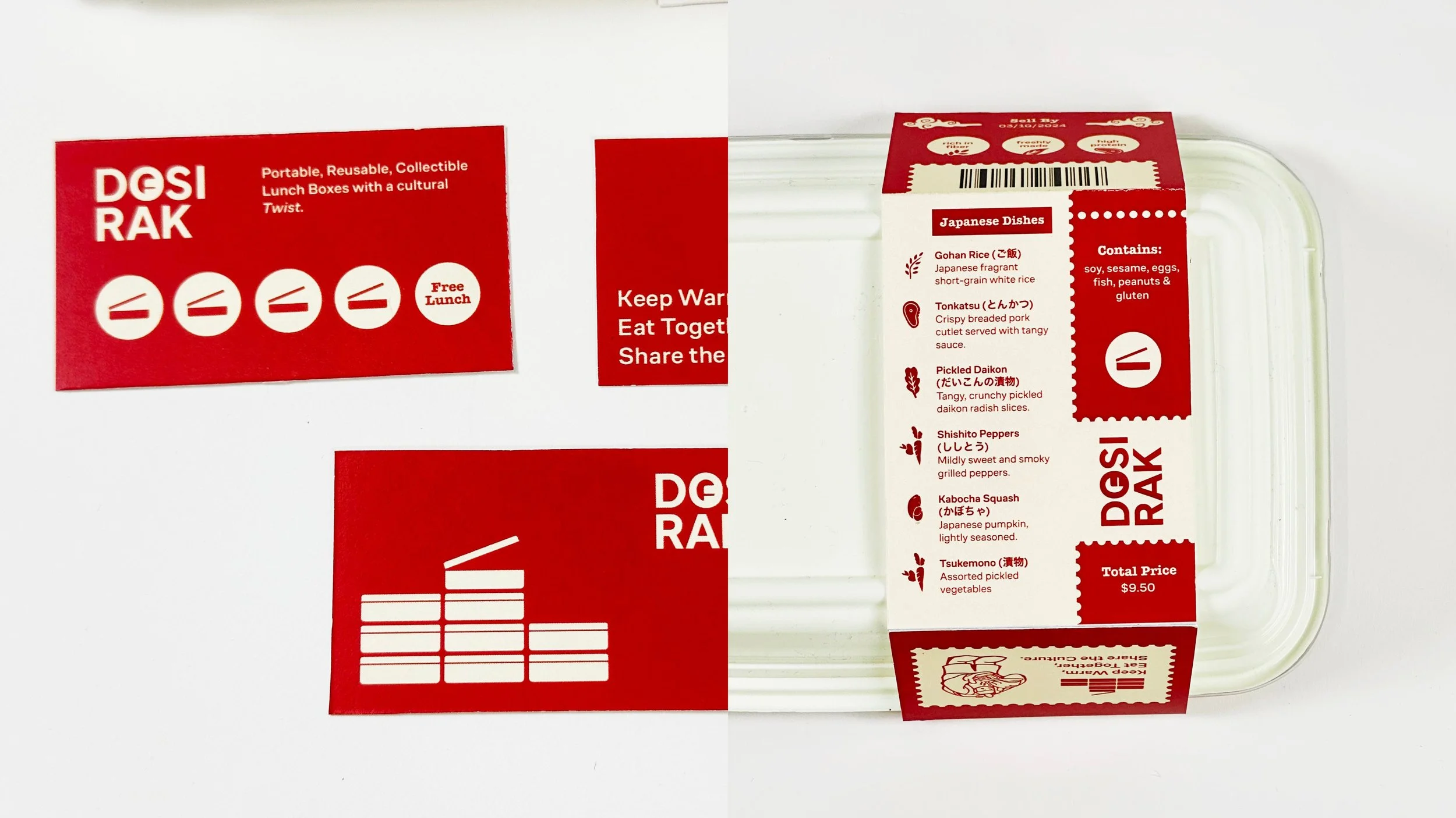
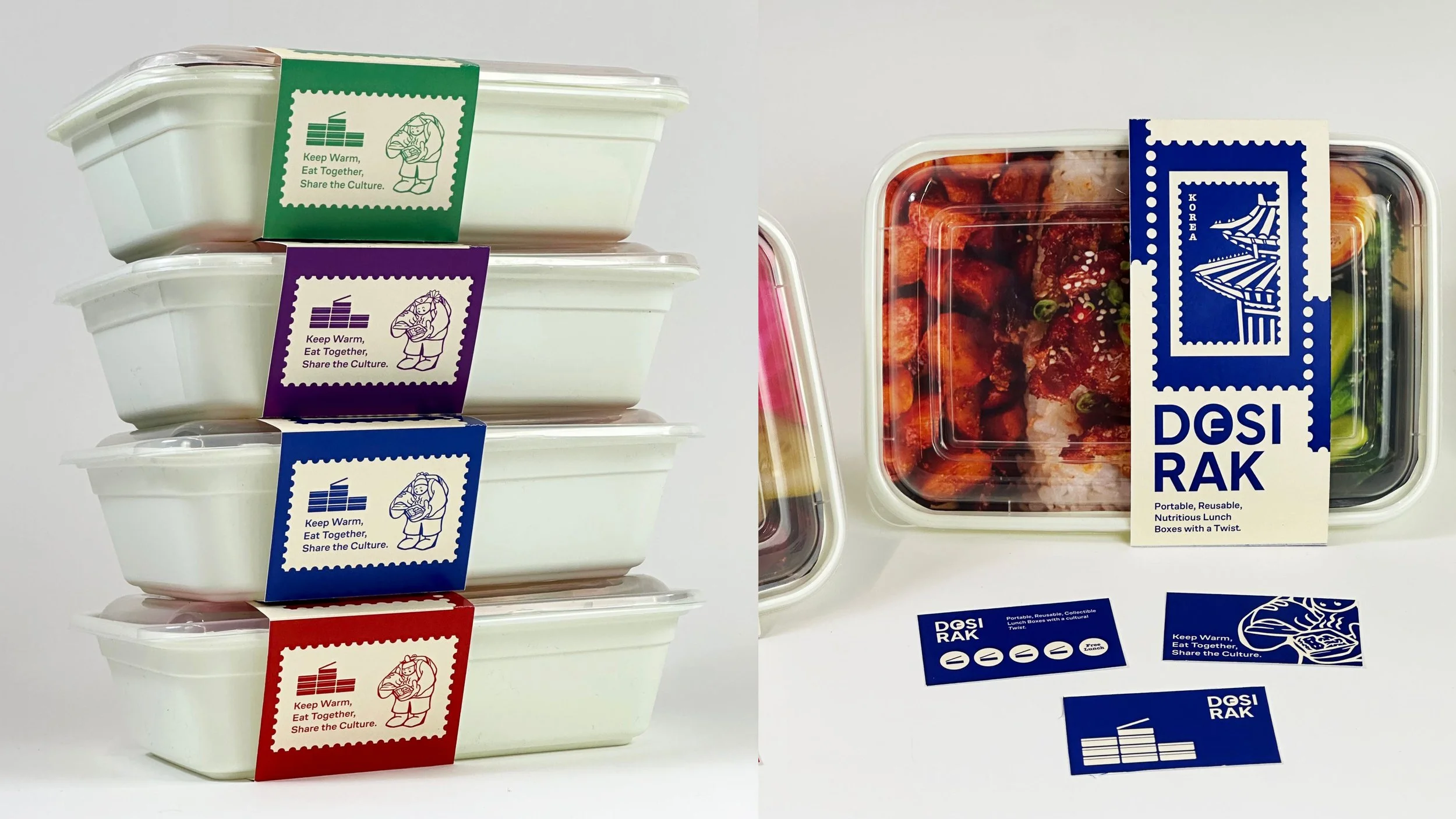
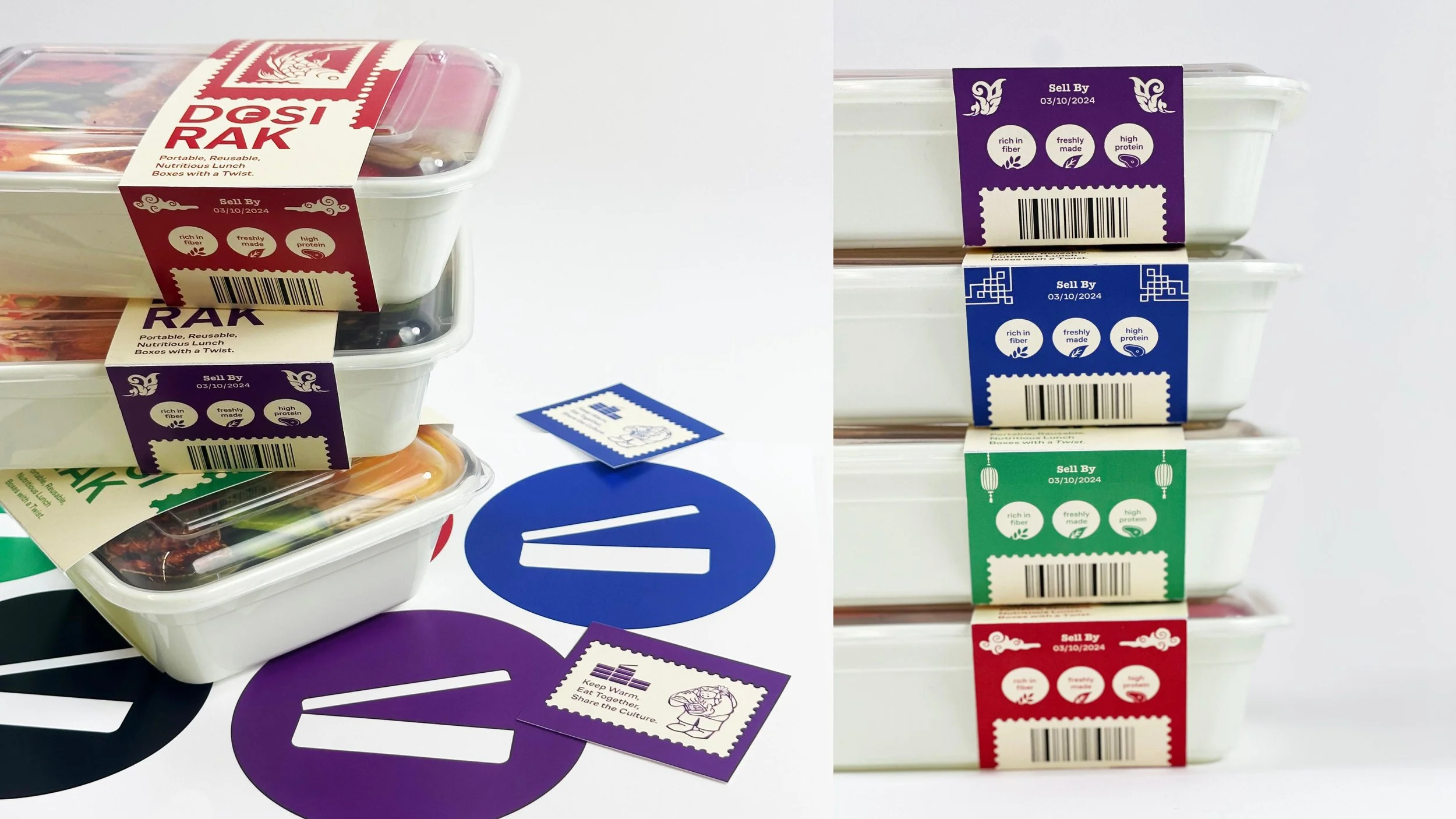
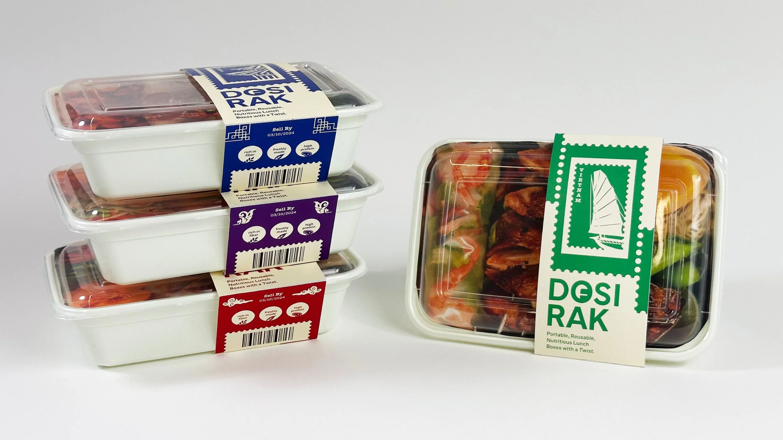
Physical mockups were designed and printed to replicate the self-initiated project.