Minhwa coffee:
culture in a can
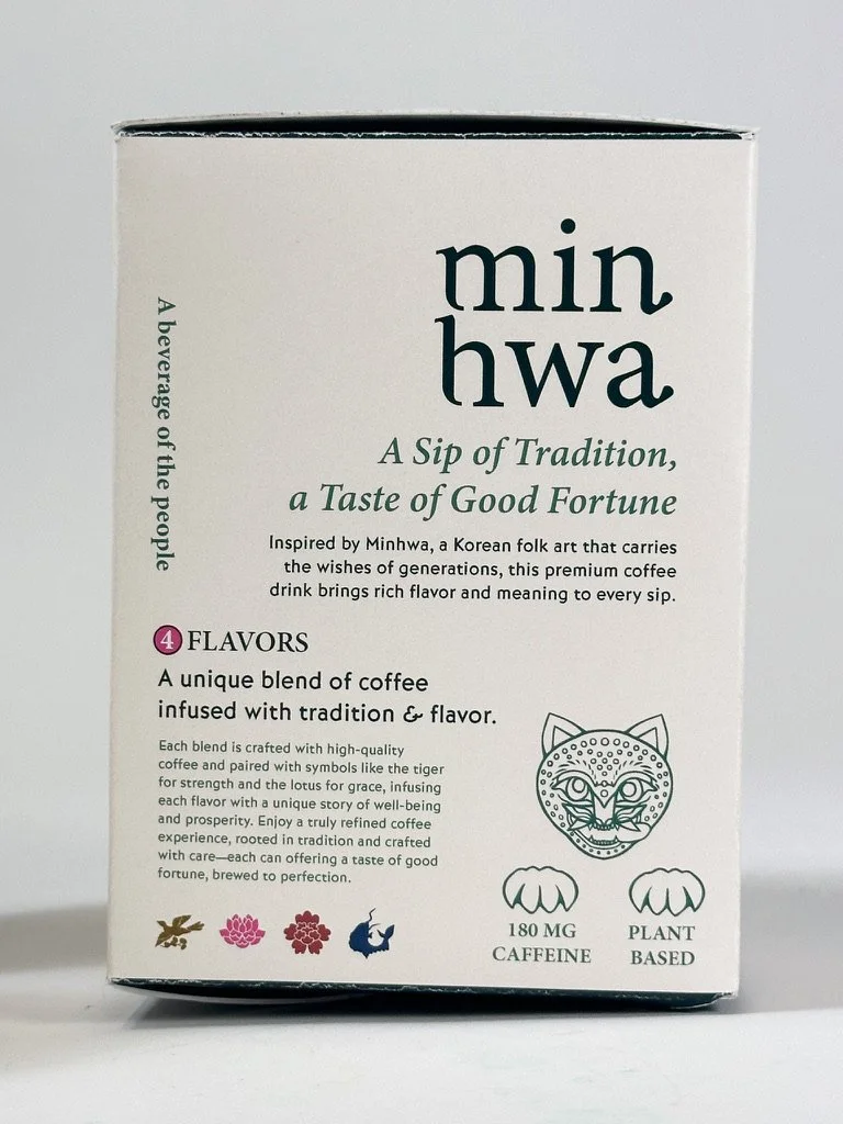
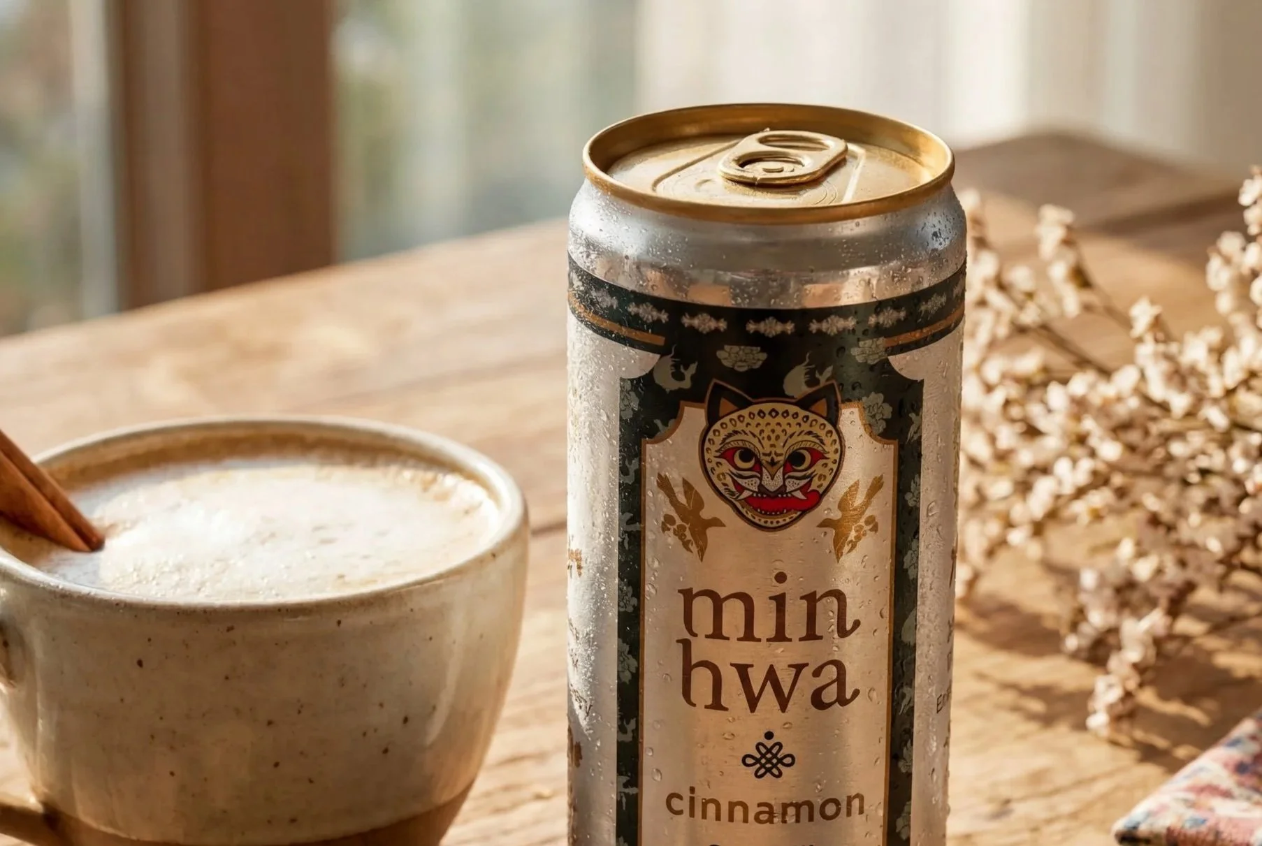
Minhwa Coffee is an oat milk latte brand that blends tradition with intention, offering warm blessings in every can. Inspired by Minhwa—a form of Korean folk art rich with symbolism and charm—the brand brings cultural heritage into modern packaging.
How did this brand come about?
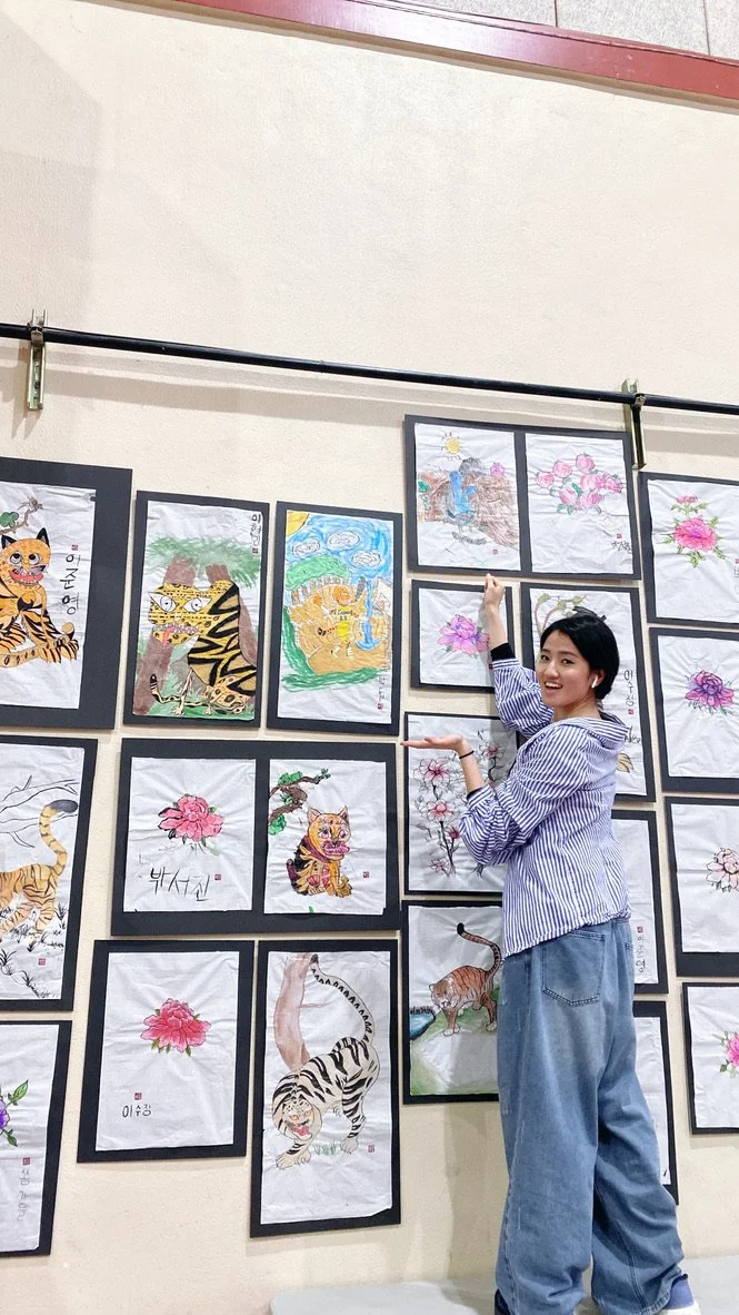
I’ve always wanted to create a gift that I could give to friends whenever I came over their house or something that could encourage them in a difficult situation. For me, my friends would always gift me good snacks or a beverage from a local store.
At the time I was creating this brand, I was also teaching students in a Korean school the art of “Minhwa” which is a traditional Korean painting style that used specific motifs and symbols to illustrate a message or a blessing. Just like modern times, paintings and art pieces were used as gift exchanges with specific intentions. I wanted to use this intention in a portable product that could help bring others joy and assist in times of need — which is coffee!
The Target Audience & Design Challenge
Designed for those in their mid-20s and beyond who love gifting meaningful experiences, whether treating a friend or indulging themselves. This audience is curious, open-minded, and drawn to cultural depth. They may want to explore Korean heritage more intentionally, or simply appreciate beautiful, collectible packaging worth keeping long after the product is gone.
Minhwa folk paintings are rich with color, pattern, and symbolism. Balancing that visual complexity into a cohesive design system was a core challenge. I also wanted to develop a set of symmetrical, illustrated icons that could extend the brand beyond the paintings themselves. The goal was to honor what I genuinely admire about Minhwa while pushing it into something modern, distinct, and unmistakably luxurious.
Early Ideation Phase
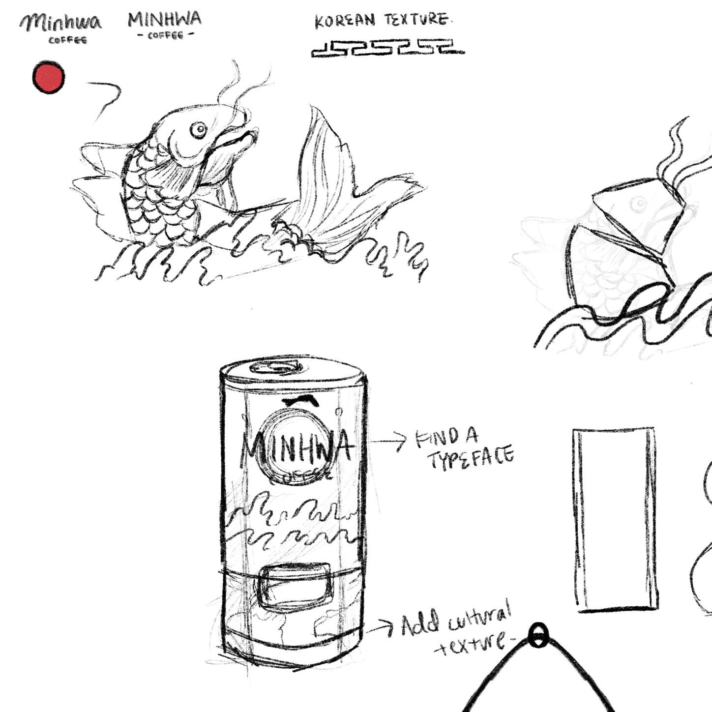
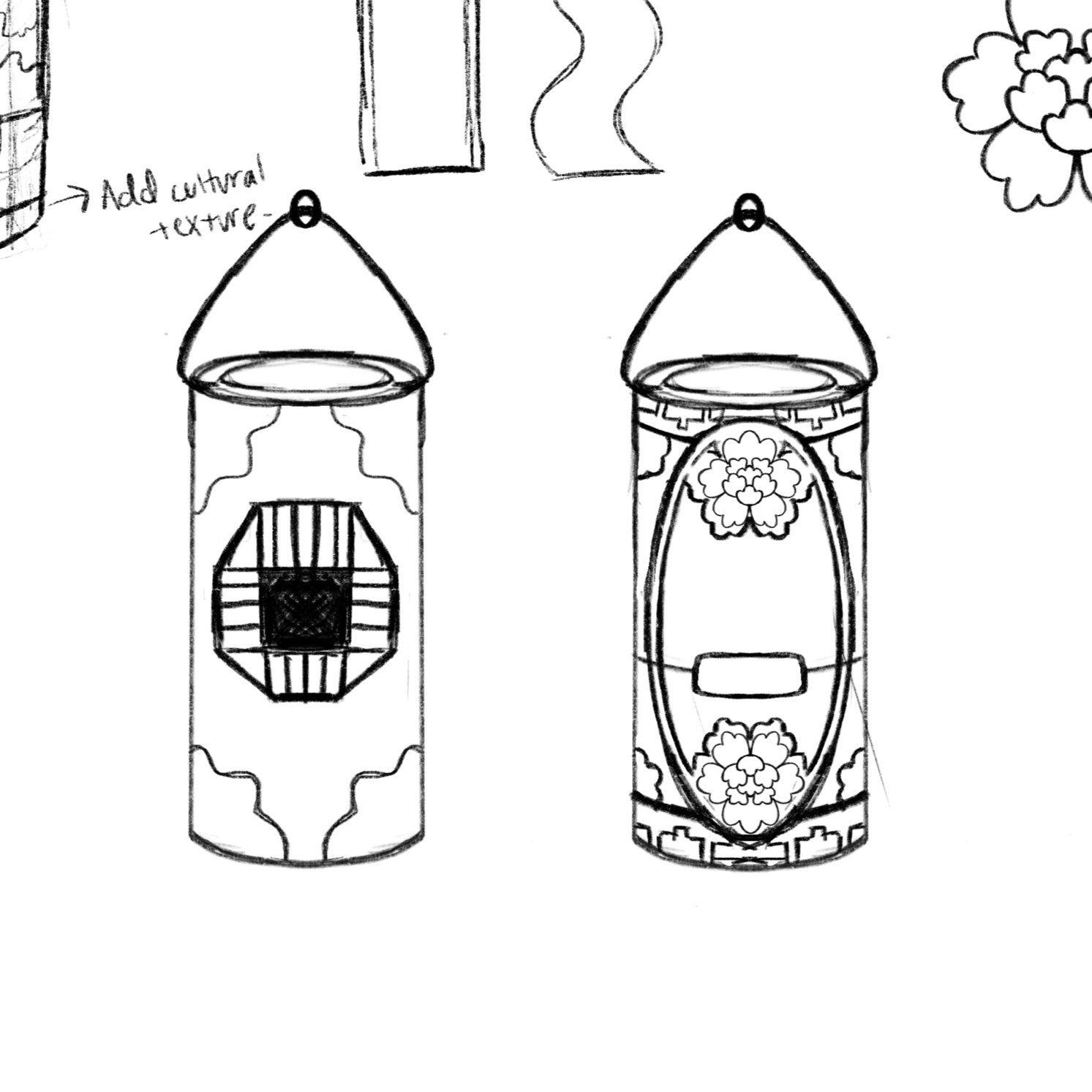
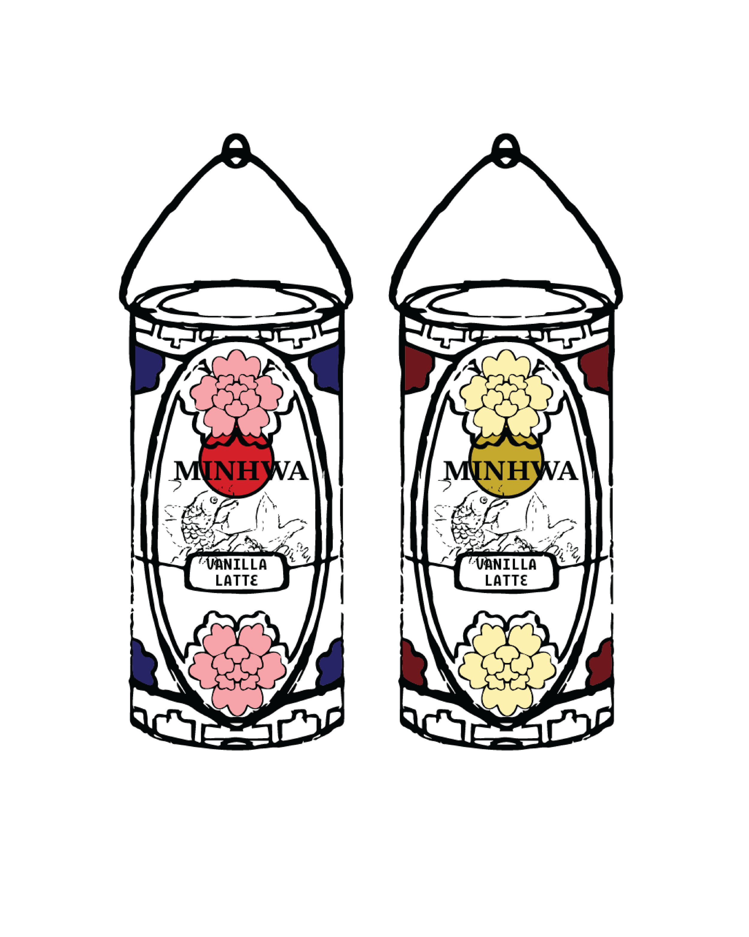
During the ideation phase, I explored can design layouts inspired by classic Minhwa paintings.
These are the earliest drafts from that process.
Art Direction
Exploration
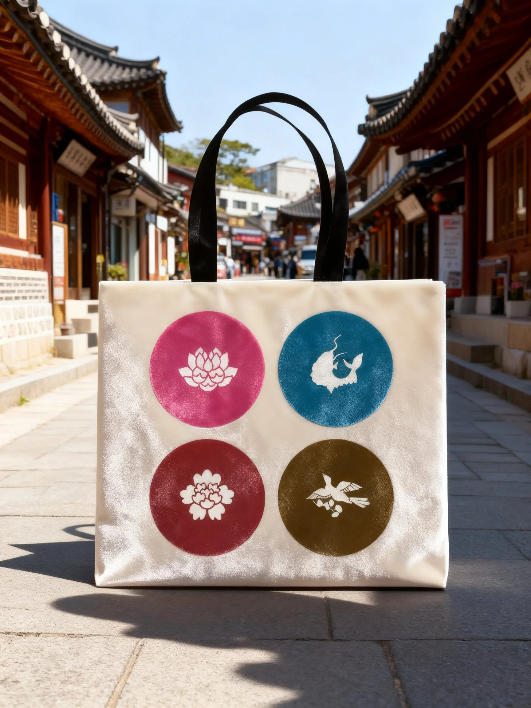
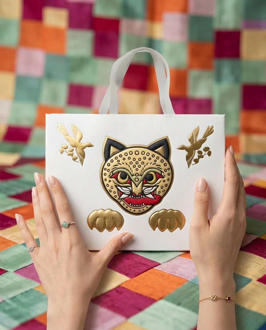
The world of Minhwa has room to grow. Rooted in centuries of Korean visual culture, the brand's art direction can extend naturally across a wide range of deliverables and experiences. Here are a few directions it could expand into.
Developed Identity + Physical Mock Ups
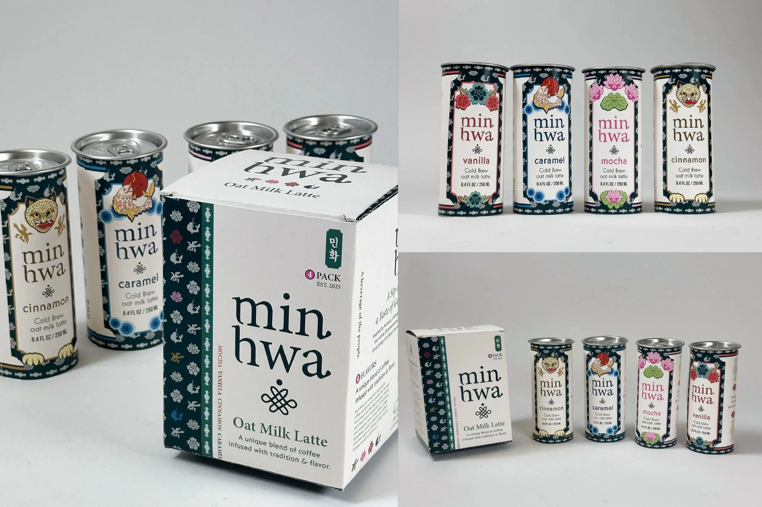
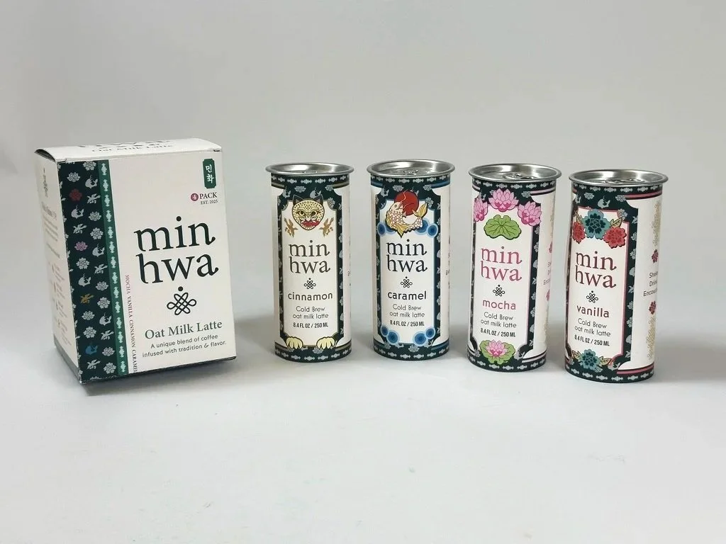
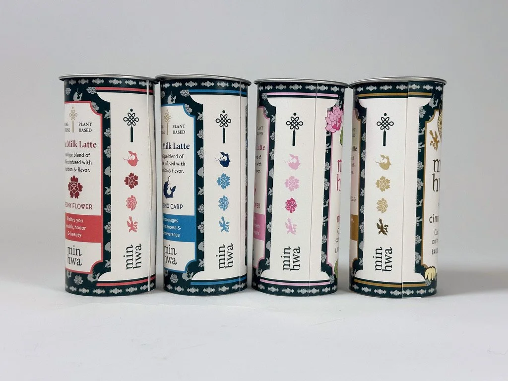
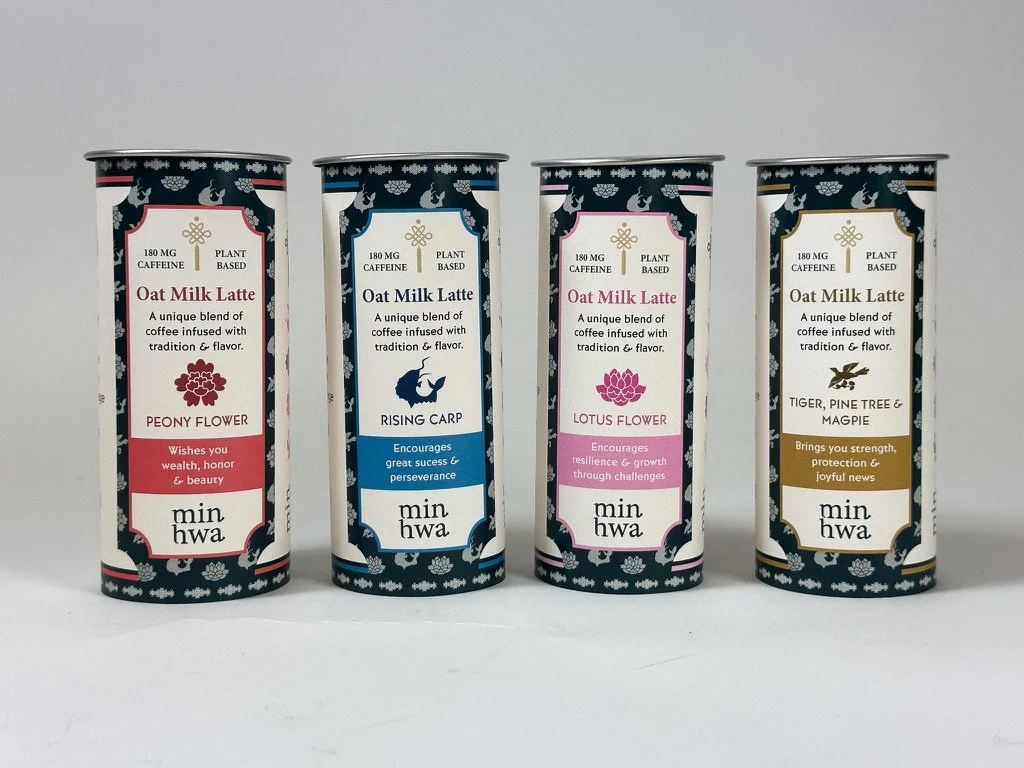
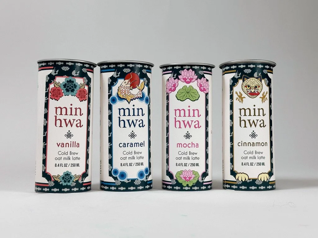
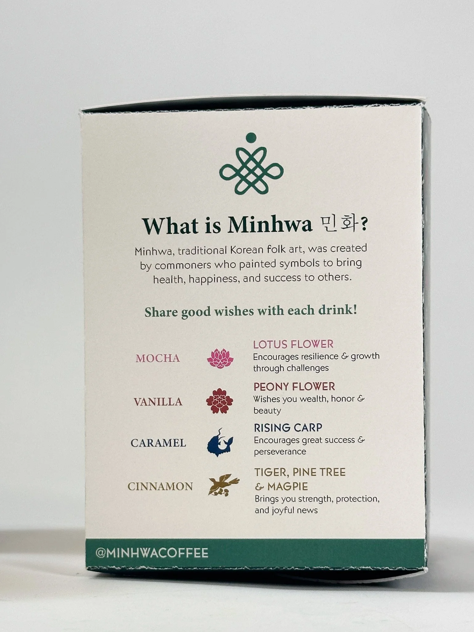
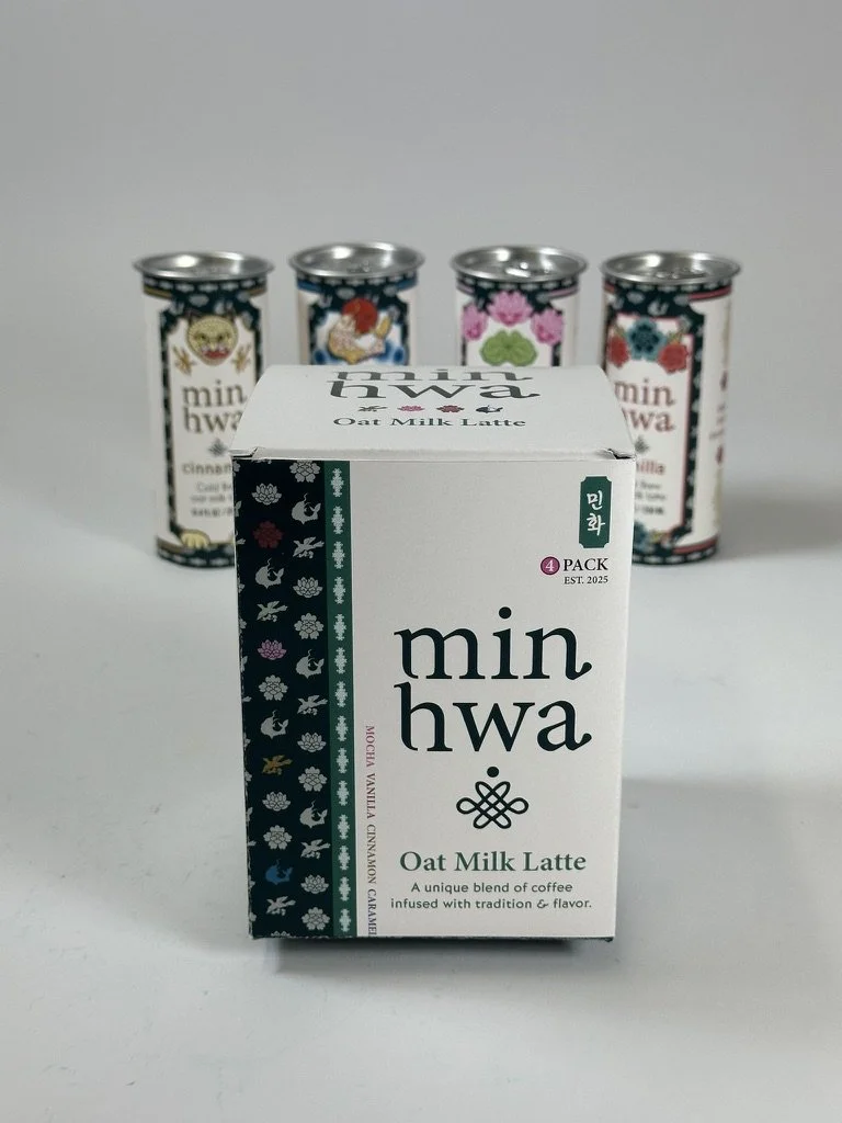
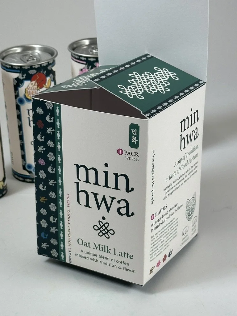
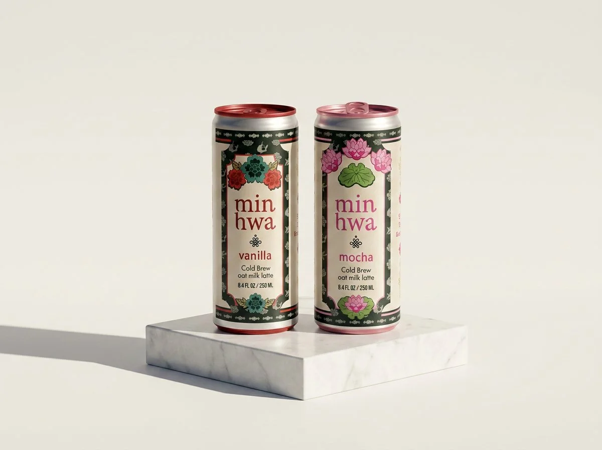
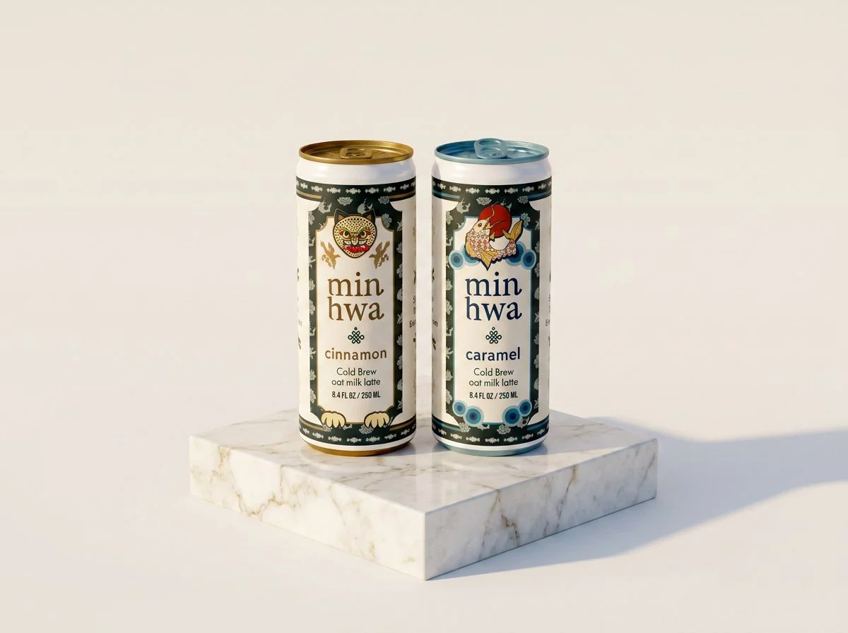
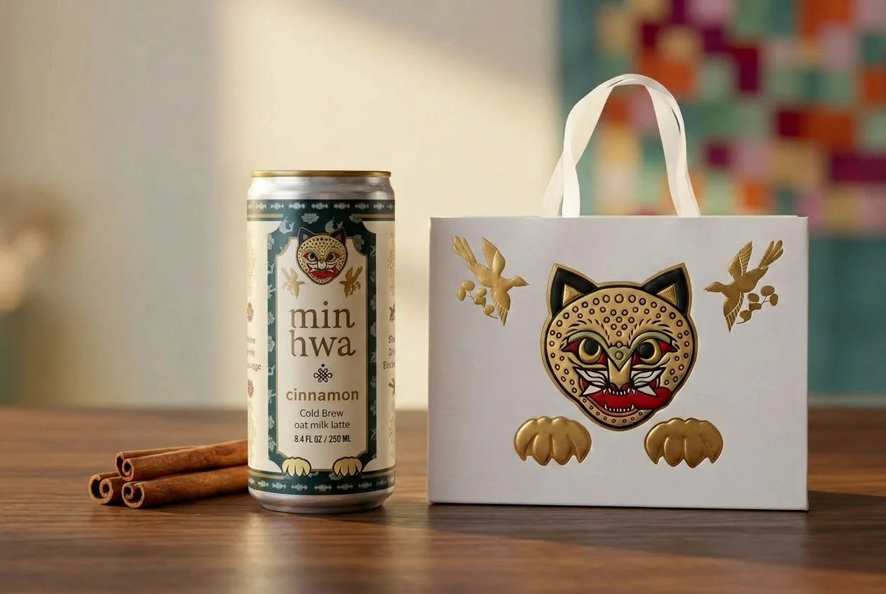
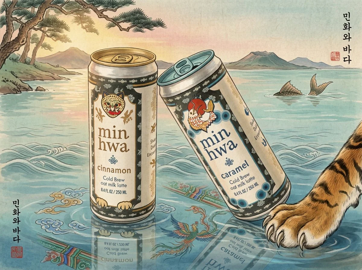
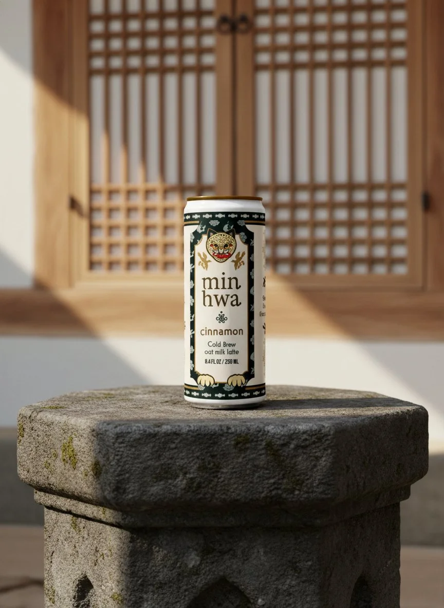
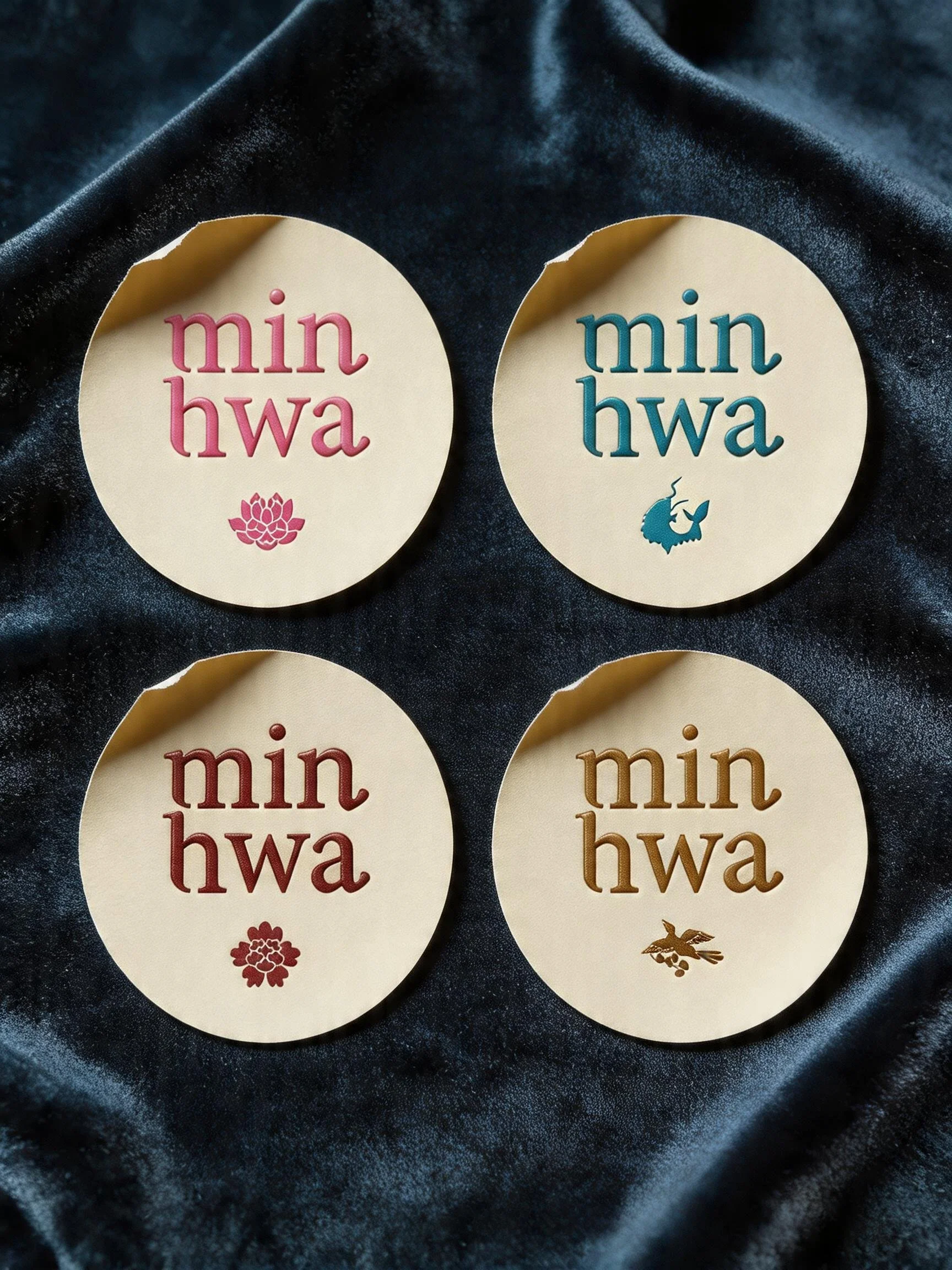
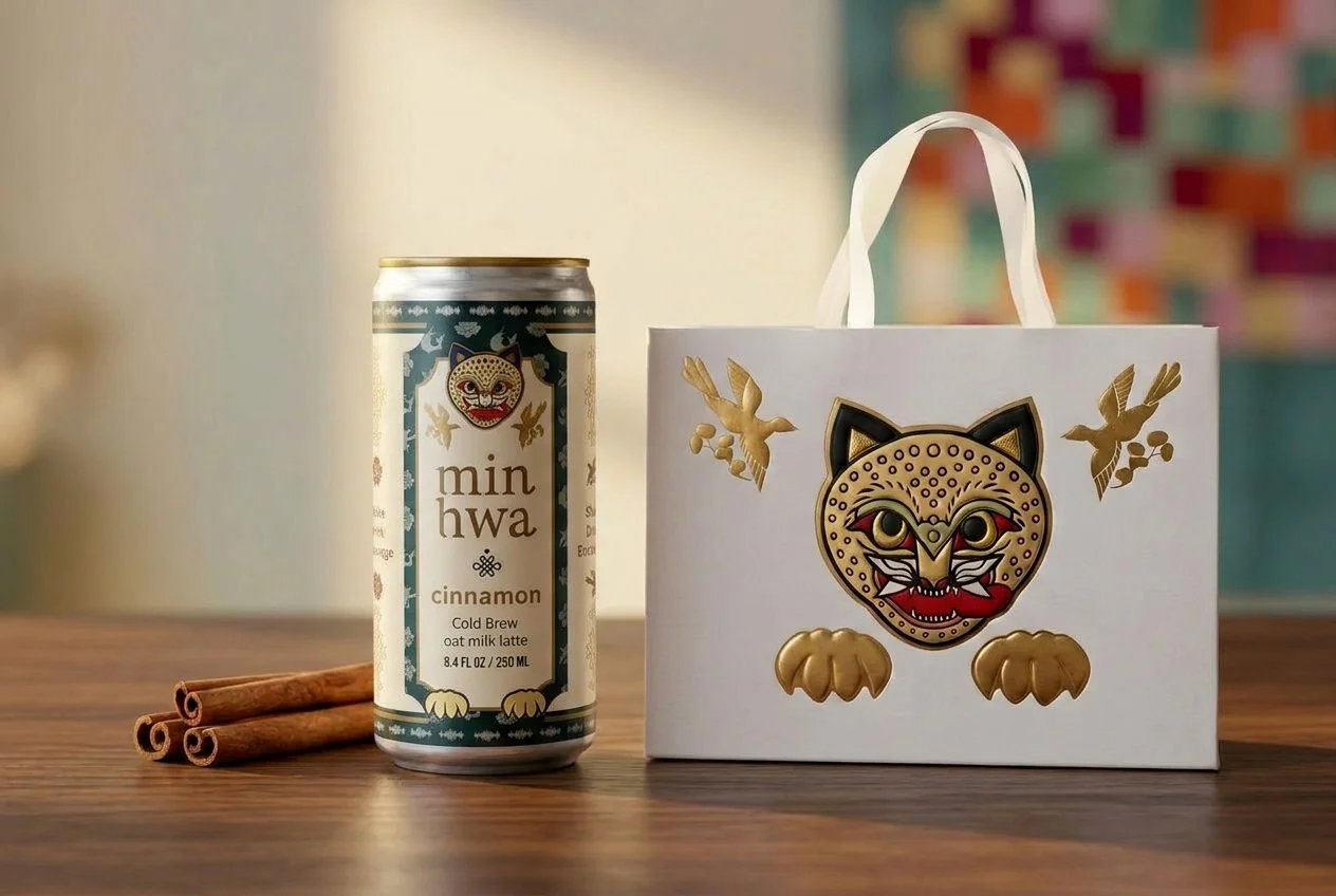
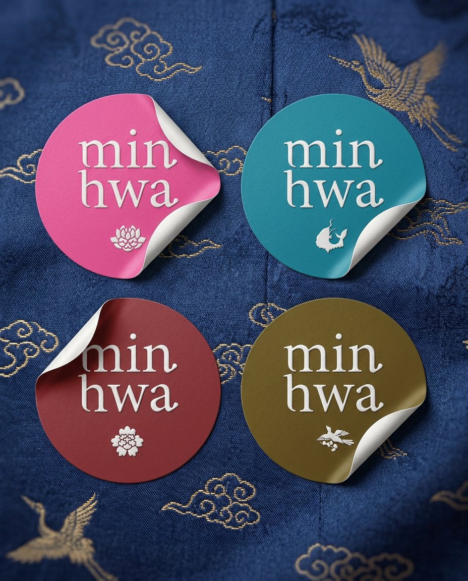
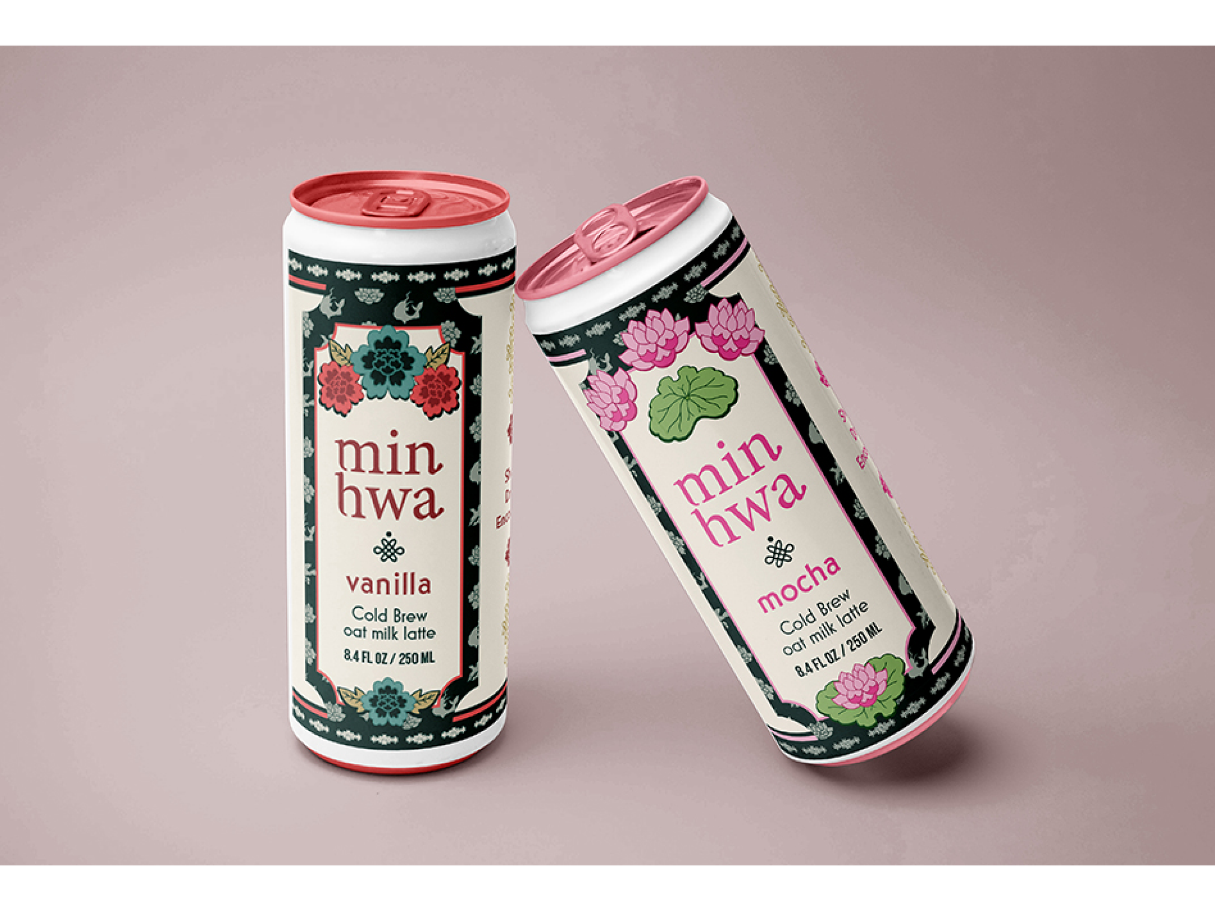
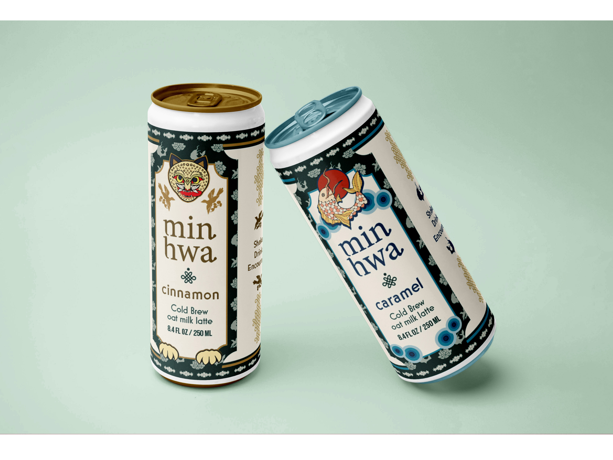
Each can is anchored by an iconic symbol drawn from traditional Korean folk paintings: the Tiger, the Peony, the Lotus, and the Carp. These motifs were chosen to represent the four different flavors, giving each can its own signature color and meaning while maintaining a consistent layout structure for brand cohesion.
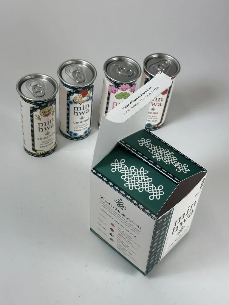
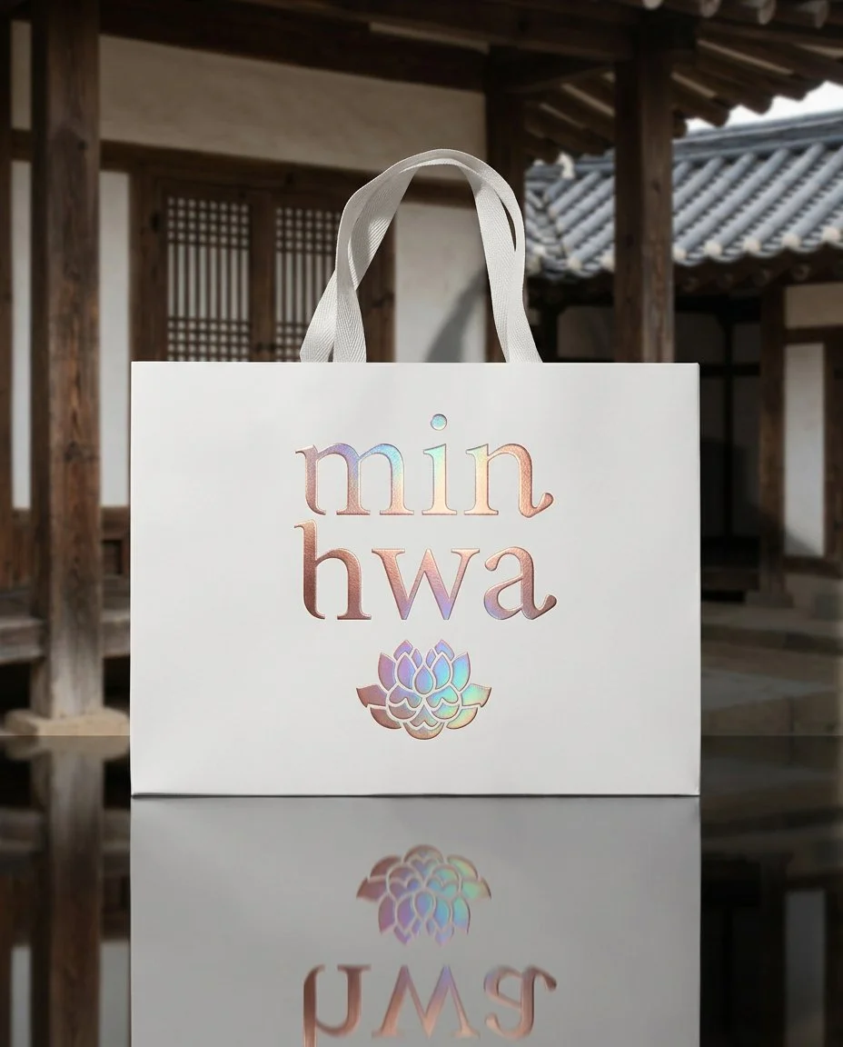
Every motif carries a traditional blessing. The Tiger, Pine Tree, and Magpie together represent protection, wisdom, and good news; the Lotus Flower symbolizes purity and spiritual renewal; the Peony evokes beauty, prosperity, and celebration; and the Rising Carp stands for perseverance and transformation. Each is reimagined with soft textures and a modern layout, blending heritage and contemporary design to offer not just a drink, but a moment of meaning.
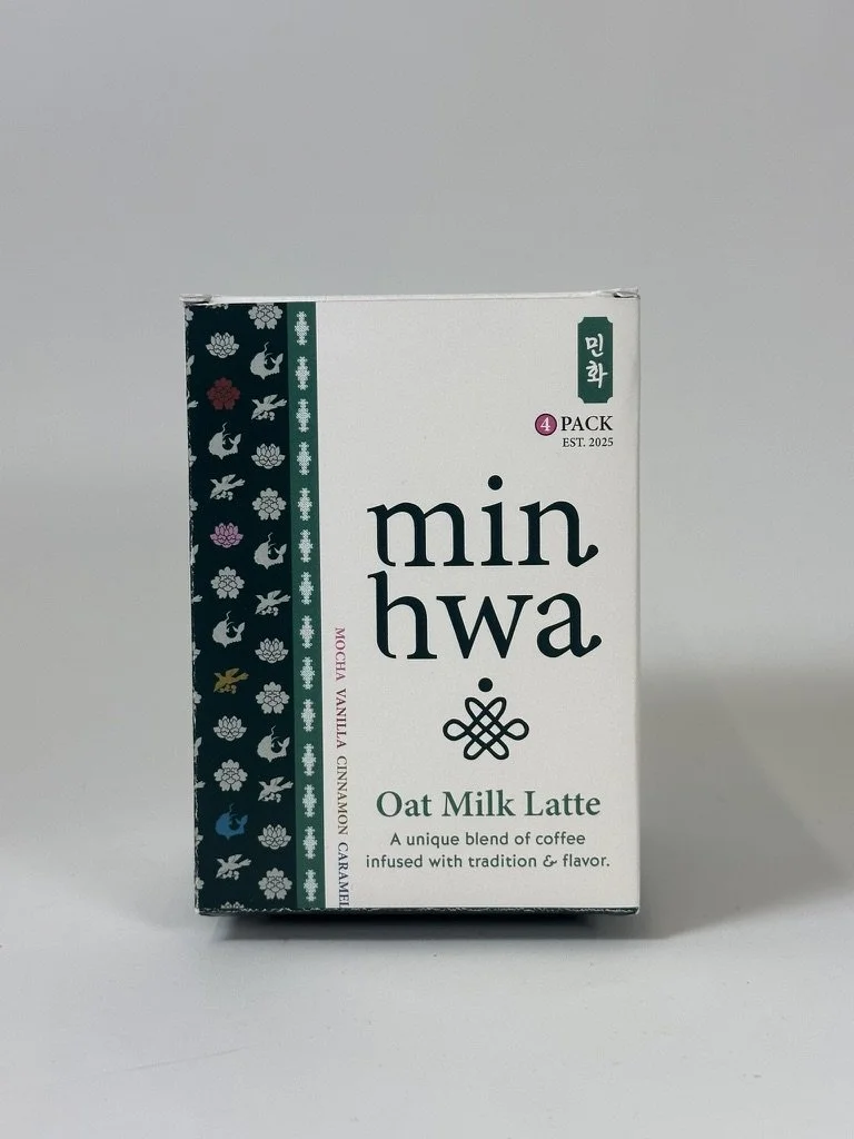
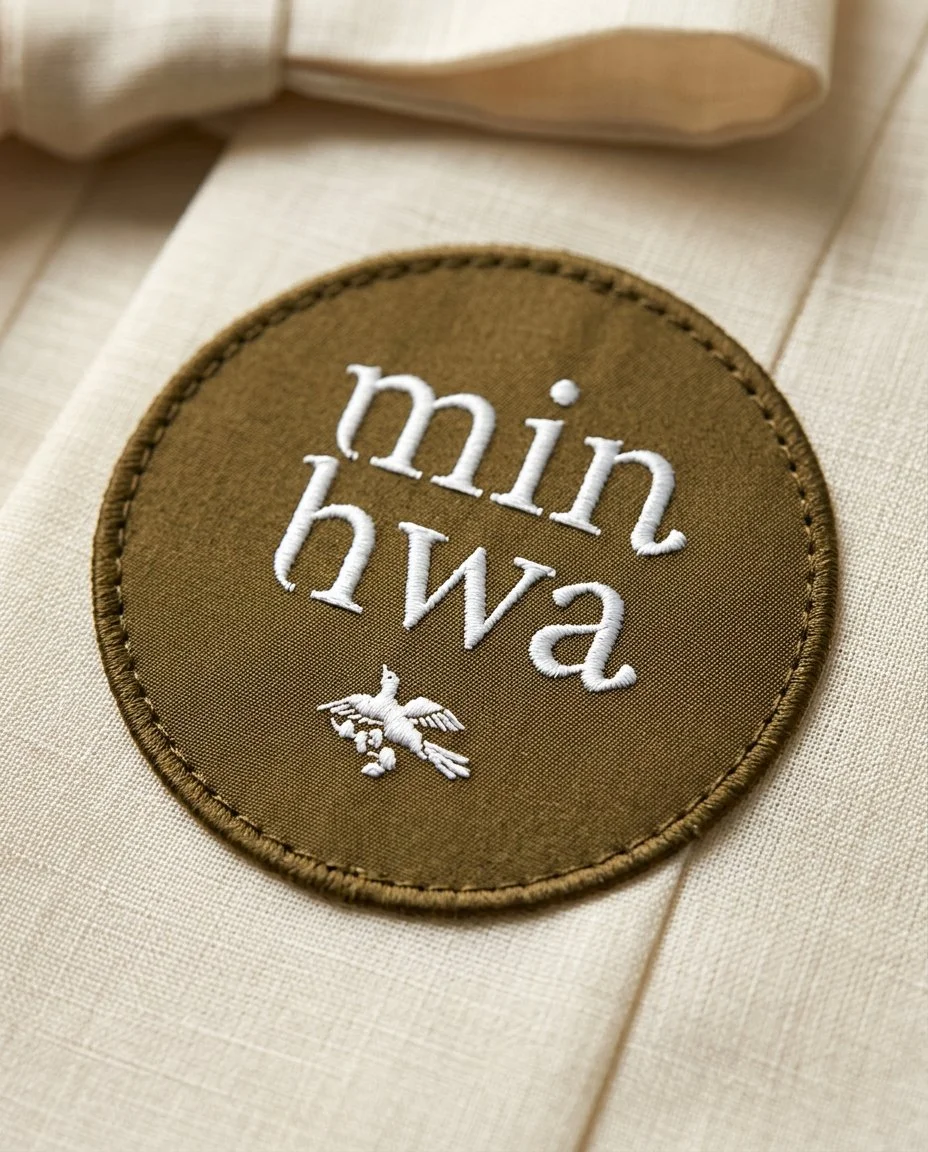
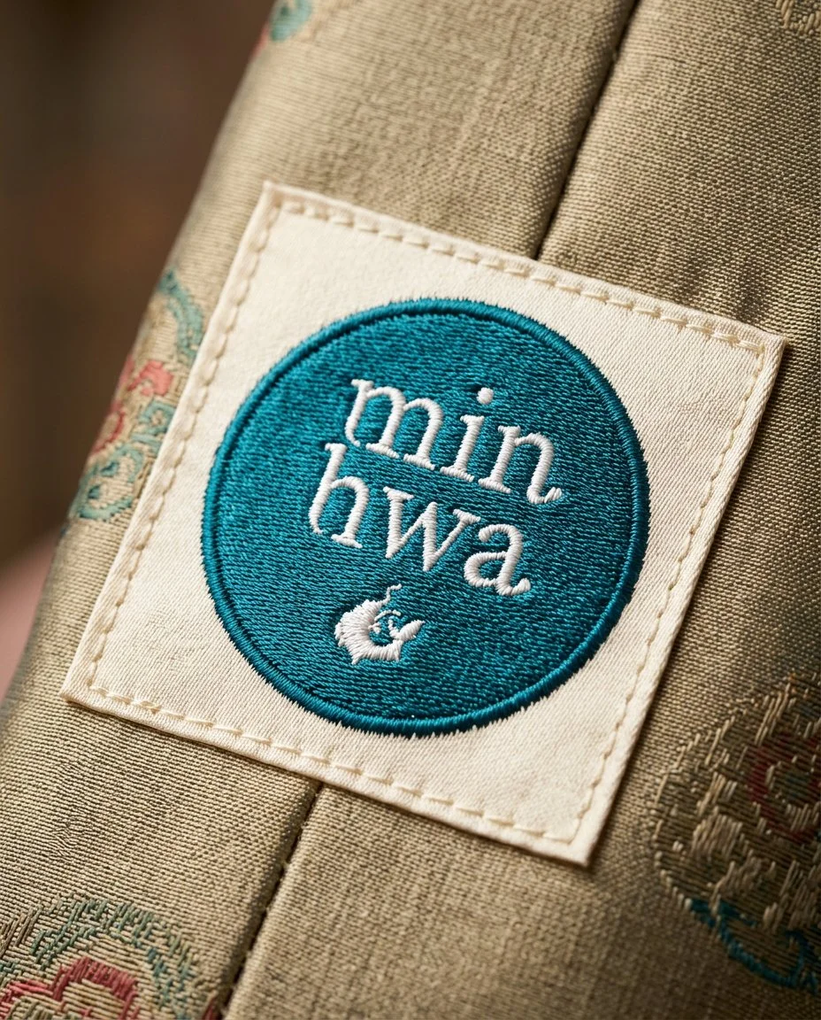
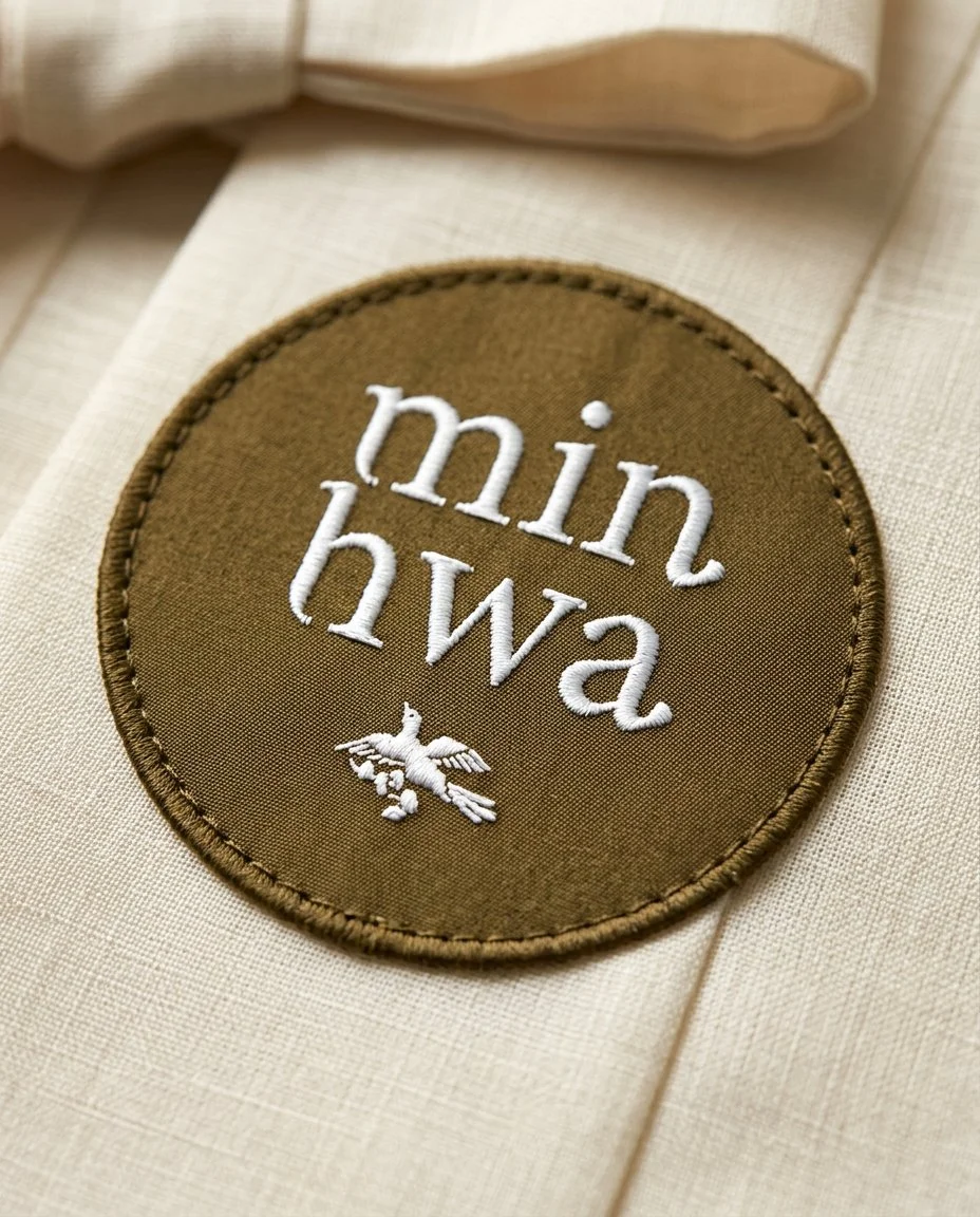
The wordmark was inspired by the way Korean syllables stack vertically when written. The letterforms were hand-edited to echo the angle and gesture of a calligraphy brush stroke, tapering upward with a deliberate blot at the end of each mark.
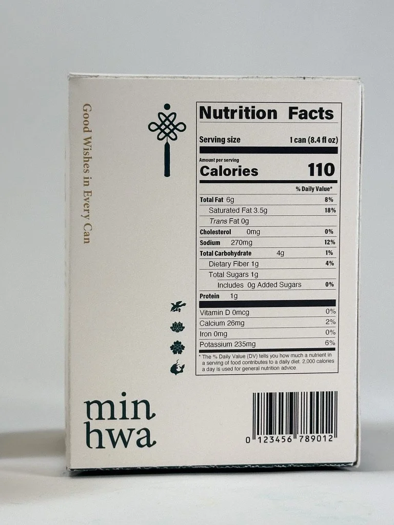
The overall packaging layout was developed through Procreate sketches, informed by reference imagery and an ongoing exploration of visual hierarchy. The illustrated outline of each Minhwa motif is also used as a repeating pattern across the label and box design, with four distinct colors anchoring each symbol and tying the full collection together.